To comply with my NDA, I have omitted and obfuscated all confidential information. The information below is my own and does not necessarily reflect the views of Intel Security.
Details
Intel
2016
My Role
From 2015-2016 I was the design lead responsible for the redesign of Intel’s flagship security product. My team and 70+ developers delivered a reimagined PC security experience to over 80 million users worldwide.
Customer Insights
The research team and I conducted follow-home studies, usability research, 3rd party evaluations, NPS surveys and more to appraise the customer journey.
Design Strategy
I conceptualized an ideal user experience with the design team. Leveraging all we knew about our users and guided by our design principles we were able to better their product experience.
Product Vision
I worked closely with product management to demonstrate the proposed solution’s effect on conversion metrics, and presented the product vision to executives.
Solution Scoping
I collaborated with engineering architects and stakeholder groups to consider all constraints, and negotiated feature priority for the first release and beyond.
Design Execution
I led a cross-functional design team. Together we designed wires, rules, product flows, mockups, interactive prototypes, and specification docs.
Design Efficacy
I worked alongside 9 scrum teams (over 70 developers) world wide. I provided support and design specifications before, during and after sprints.
The Challenge
Become a trusted advisor
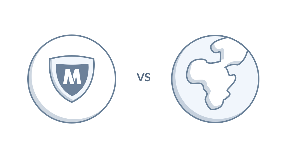
Intel’s flagship security product, McAfee® Total Protection™, was designed so users could “set it and forget it.” That’s how users wanted it and that was the mantra for anyone working on the product. However, the usage paradigm prevented the product from highlighting all the ways it stealthily and meaningfully protected users as they did all the things users do with PCs, Macs, smart phones and tablets.
People get tricked, computers get viruses, ransomware hijacks machines, accounts get hacked and identities are stolen. Dealing with these things is emotional, which makes security emotional. We believed we could establish a stronger sense of security and faith in the product than “set it and forget it” afforded.
Our challenge was to reimagine every way users engaged with McAfee security and redefine every way McAfee security engaged with them.
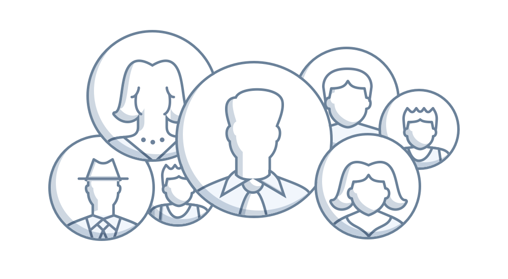
Our first task was to learn more about the people who used McAfee Total Protection.
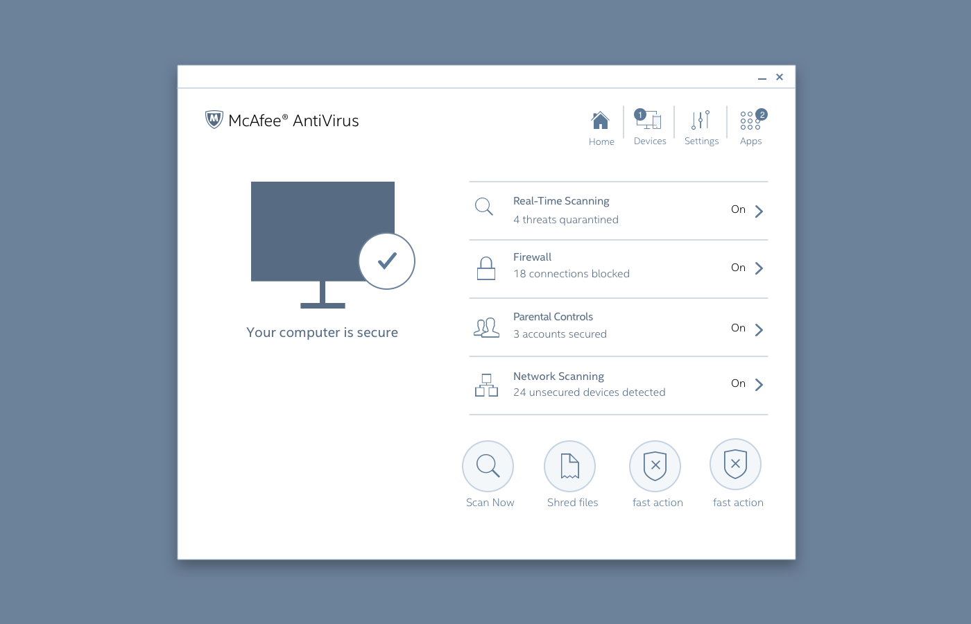
The Old Version (2010 – 2016)
Reviewing the experience
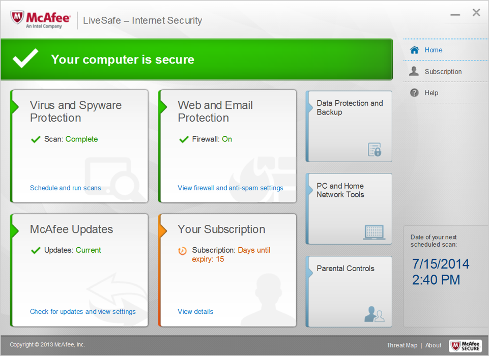
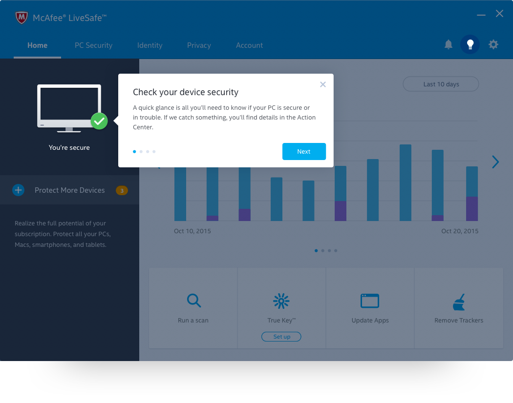
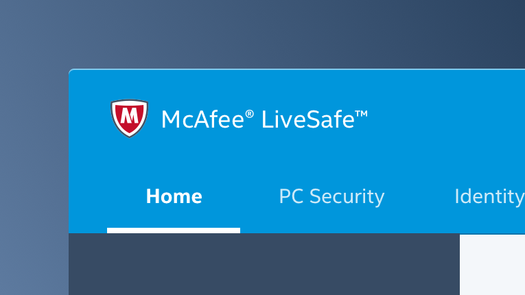
McAfee Total Protection
Secure every device you own from viruses, malicious mobile apps, risky websites, phishing emails, as well as, track a lost device, manage passwords, and store sensitive files in a super safe place.
Listening Posts
There were many sensors keeping a pulse on our customers. We knew how likely they were to recommend the product, challenges that resulted in a support call, and app usage. All of which clearly indicated that it was time for a dramatic change.

Application Analytics
We tracked which apps customers were using and what they were doing with them. On average, users ignored 90% of everything they were paying for.

Net Promoter Score
Users were asked how likely they were to recommend McAfee. Many were neutral and didn’t feel it was remarkably different than our competitors.

Support
Our customer support team did an excellent job tracking call drivers. At the top of the list, users needed help with refunds and uninstalling the product.
The Deep Dive
Getting closer to our users
As we were nerding-out over the volume of data we gathered, we quickly realized the numbers weren’t telling the whole story. We couldn’t answer “why” for anything. Why weren’t customers using all the features, recommending the product, or keeping the product?
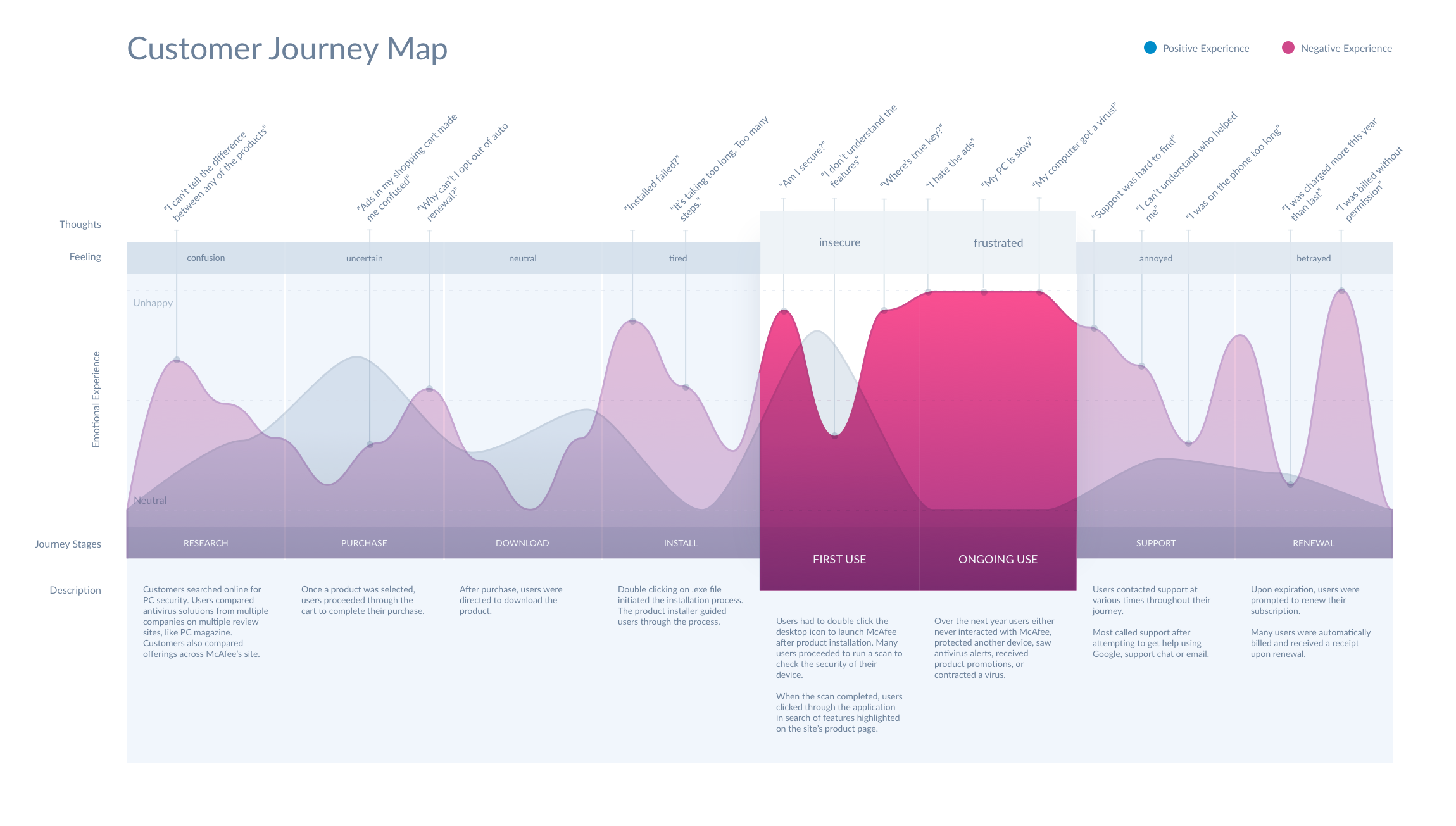
To learn more, we mapped the journey, appraised it, and observed many real-life customers experience it.
Heuristic Analysis
Leading with the PURE method, we evaluated the end to end experience and rated the usability of the each use case.
3rd Party Review
A third party agency evaluated every stage in the user’s journey and compared our results with our closest competitors.
Follow-home Study
We met with over 30 users nationwide in their homes to observe them research, buy, download and use McAfee their personal PCs.
Focusing the Journey
During the follow-home studies, we observed users fumbling through purchase decisions, failing to complete transactions, unable to install the product, confusion and frustration using the product, and many long support calls.
“No amount of quantitative data was more significant than watching real people experience our product.”
All things considered, product usage impacted the cumulative experience more than any other stage in the journey. The challenges users had with the PC app caused them to question the utility and integrity of everything McAfee offered.
The Discovery
Customer Needs
I remember every customer we met. I can tell you who they were, a little about their life and family, their PC security needs, where our product exceeded expectations, and where it failed entirely. Participating in their journeys imbued our mission with significantly more purpose.
Below are the key insights that shaped our design strategy and vision for the product.
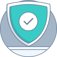
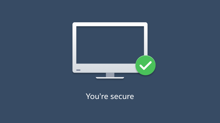
Show me I’m secure
Users didn’t have faith in green checks. They needed system transparency and material proof that the app was securing everything they were doing.
Say it in English
Users didn’t understand much beyond antivirus. They needed features framed around needs they recognized and less technical jargon.
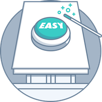
Keep it simple
Users had a hard time finding specific features. They needed the product suite to be tightly integrated, better organized, and goal oriented.
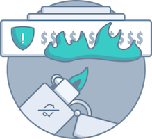
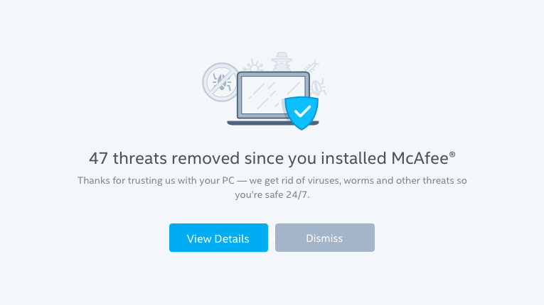
What am I paying you for?
Users were surprised when the app alerted them about a problem. They needed the PC app to demonstrate itself as a proactive solution to trust it was working.
stop. messaging. me.
Users were beyond frustrated with product alerts and ads. They needed the product messaging to be respectful and relevant to whatever they were doing.

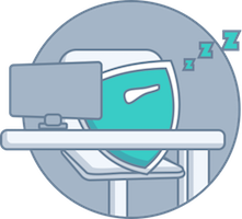
Speed it up
McAfee’s AV engine was known for slowing PCs down. Habitually. Users blamed McAfee any time the computer’s fans fired up – even if it wasn’t the cause.
The vision
McAfee secures everything
Equipped with an empathetic understanding of our users, our goals were to make security intelligible and self-evident, establish ourselves as a trusted advisor, and help users realize everything their McAfee subscription offered.
Gone were shallow security statuses and hyperbole. We desired to establish a relationship with our users and approach security conversationally. We envisioned a future where if users had a question or concern, they would come to us to guide them.
With their trust in hand, we hoped they’d allow us to secure every aspect of their digital lives.
The solution
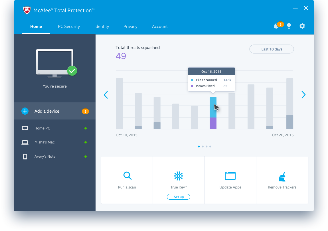
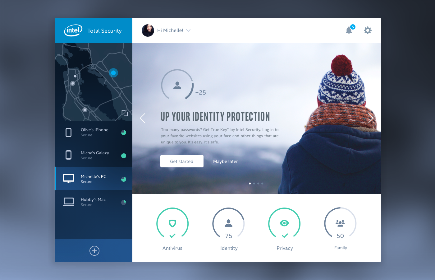
Next-Gen PC Security
Secure every device you own from viruses, apps that harvest private information, people who track you online, and hackers who steal your identity and access your accounts.
Secure it all
We believe security should be simple. With a glance, you can check your security status, protect another device, secure your passwords, or run a quick scan.
Get help from an expert
The security advisor is the heart of everything you do, delivering intelligent messages tailored to help you stay on top of your security.
Easy access to everything
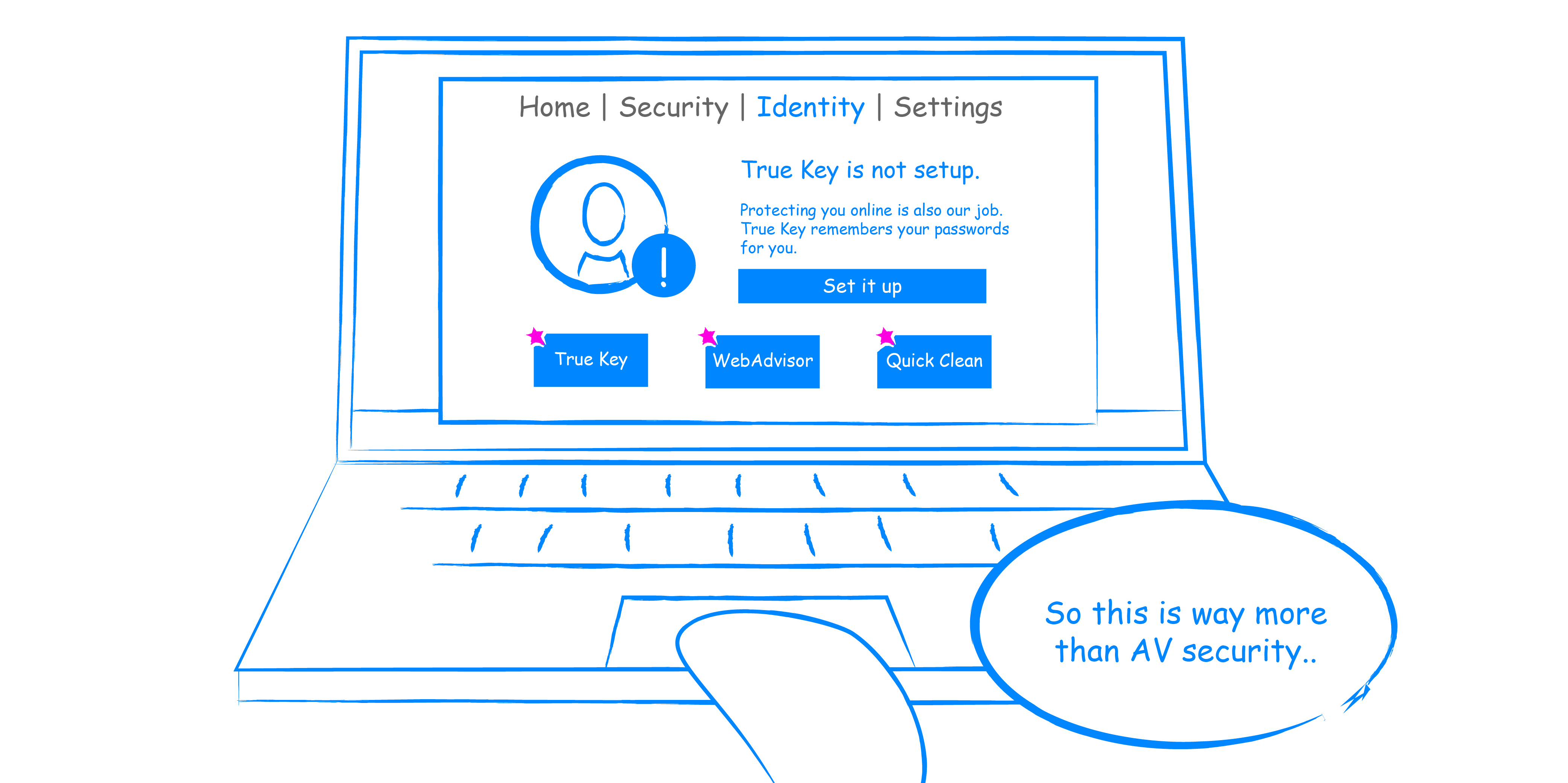
Features that secure your PC, identity, and privacy are easy to find with a menu that just makes sense. No more separate product downloads, buried settings or technical jargon.
The Strategy
Designing with stakeholders
The research insights didn’t roll in all at once – it was a progressive process that took several months to complete and we had a lot of time to marinate in our discoveries.
When it came time to socialize our findings, we quickly learned our vision wasn’t as clear to everyone else. Many asked why we weren’t taking a simpler approach to solve business needs.
As the lead designer of the effort, I had a responsibility to represent the user. It was my job to ensure our solution wasn’t antithetical to the research results and focused on fixing validated problems.
To prevent our efforts from getting lost in business objectives, I use design principles to support our strategy and inform competing stakeholder directives. Doing so helped us avoid a battle of opinions when data couldn’t be used to drive a decision.
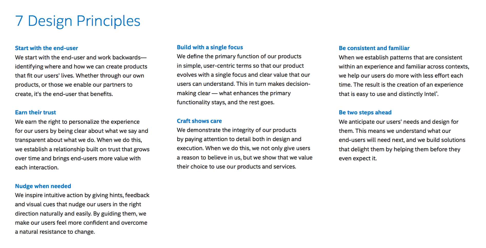
Additionally, I began to recruit stakeholders to design with me in effort to align our objectives. The moment I had an idea or new concept, I’d present it to them and we’d build on it together.
Involving a small team of stakeholders in the design process made them feel considered and gave them a sense of ownership.
Mapping Scenarios & Aligning Vision
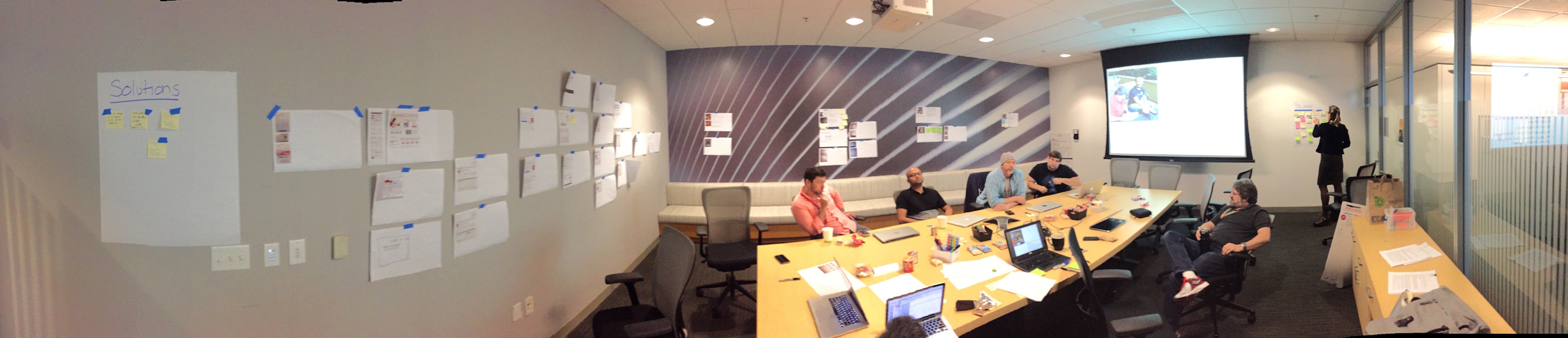
The most synergistic design activity I lead was a scenario mapping workshop. In the workshop, we reviewed the customer journey, the top 10 problems we identified, and business objectives.
Scenario mapping helped us collectively think about our users, their tasks and ideal user experience.
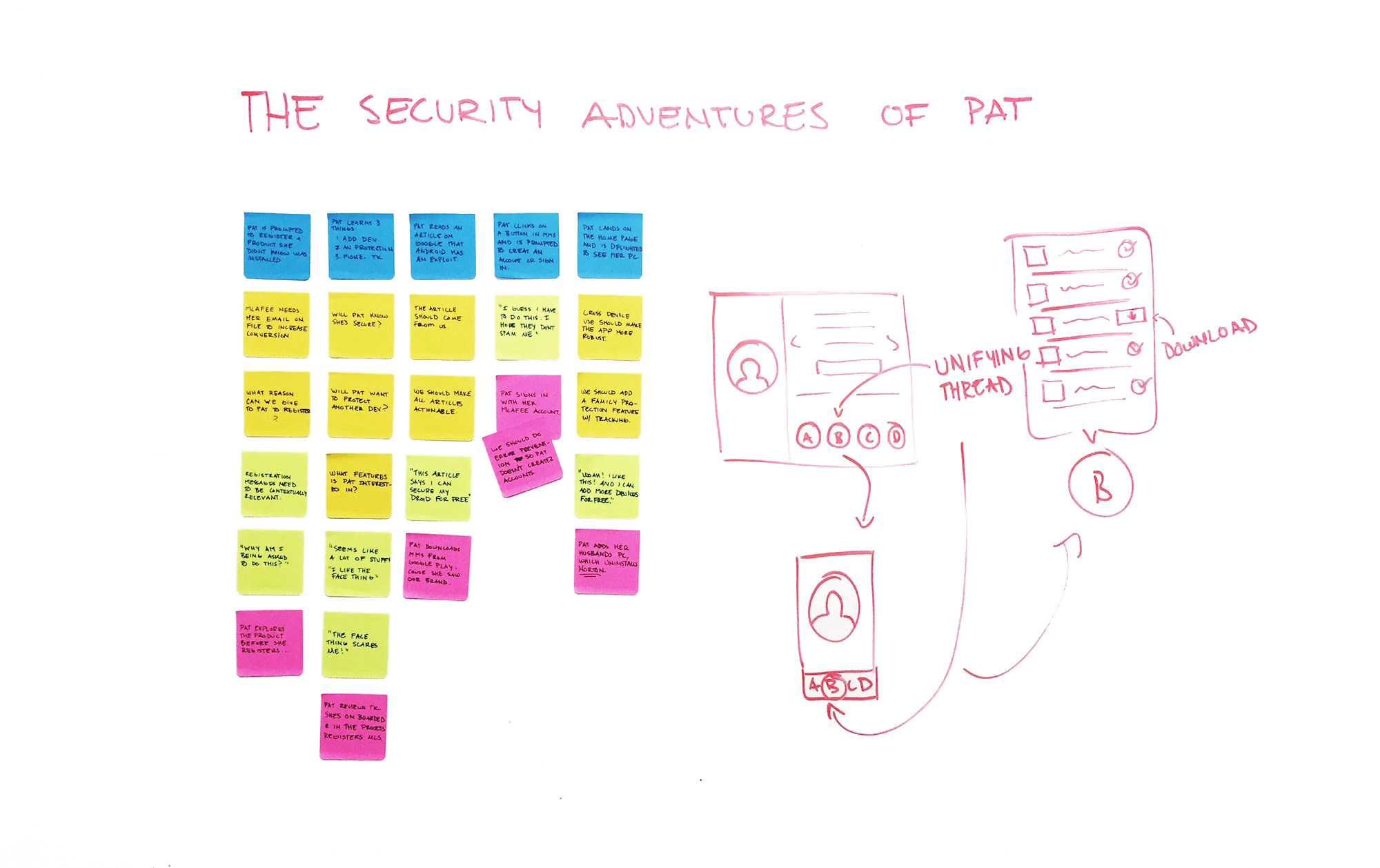
Shortly after the workshop, I presented a storyboard that included all the ideas from the scenario mapping activity. This is when the executive leadership and stakeholders agreed that the problems we identified were critical, and the design strategy began to gain traction.
In the scenario, an unassuming user learns that McAfee came preinstalled on their PC. The product greets them, they’re on-boarded, they find that it’s really easy, they’re delighted, learn there’s a lot more to the app than they expected, and choose to buy it.
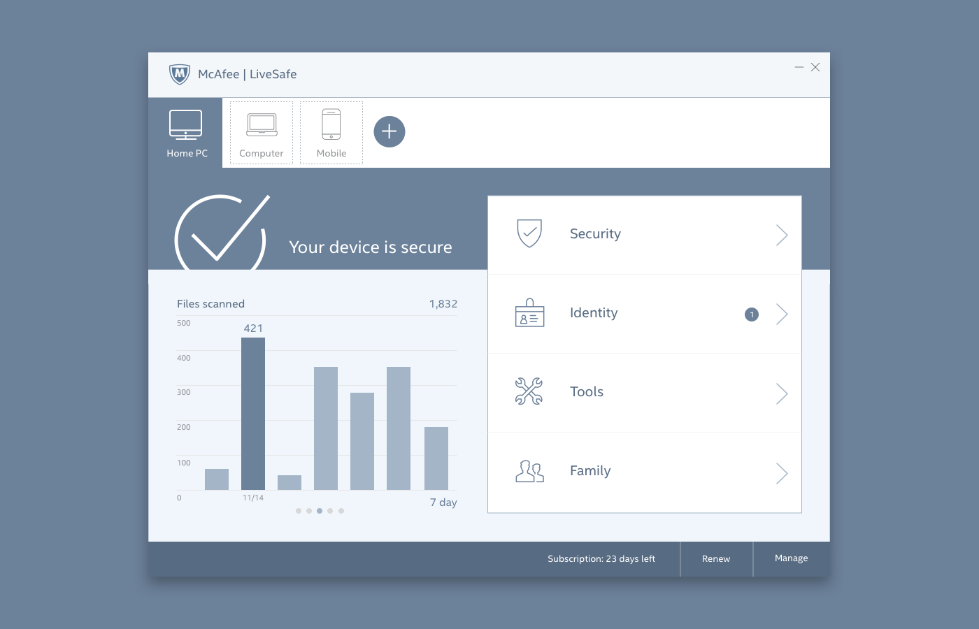
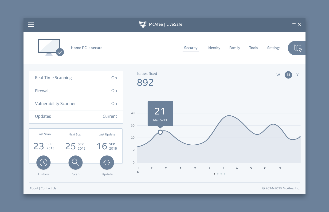
The concepts
Focusing our designs
The entire company was aligned on the problems, design strategy, and high-level solutions. The green light was lit, but constraints came from all directions and threatened the experience we hoped to deliver.
The Rational
Defending the experience
When you have over a hundred stakeholders, many people aren’t going to be included in the creative process, someone’s boss isn’t going understand a decision you made and just about everyone is going to tell you how they think you should design it.
At times I felt the swinging pendulum of perspectives and design debates were going to make it impossible for the team to hit our delivery dates.
It was my responsibility to negotiate all the feedback, rationalize it, and test anything controversial with real people.
Material inspiration
Intel’s design guidelines borrowed heavily from Google’s material design language. In 2014 it was the most modern and comprehensive design language available, and allowed us to design for any screen size and platform.
It was important to maintain consistency across products and operating systems, because users could install McAfee Total Protection on every device they owned. If a user started on a PC and shared their subscription with a mobile phone, the material design language helped us provide a consistent and familiar experience.
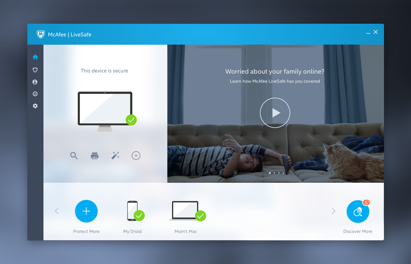
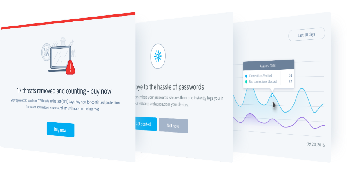
A Welcoming Experience
The welcome experience presented itself when users opened the product for the first time and we felt it was a great opportunity to establish a strong sense of security.
Our objective was to highlight four ways McAfee security constantly worked to protect its users. Our strategy was to make security familiar and easy to grasp using a metaphor, not focusing on how security processes technically work. For example, a firewall works like a traffic stop.
Users weren’t left flat-footed after the welcome experience. The Guide oriented users to the new interface and helped them get started.
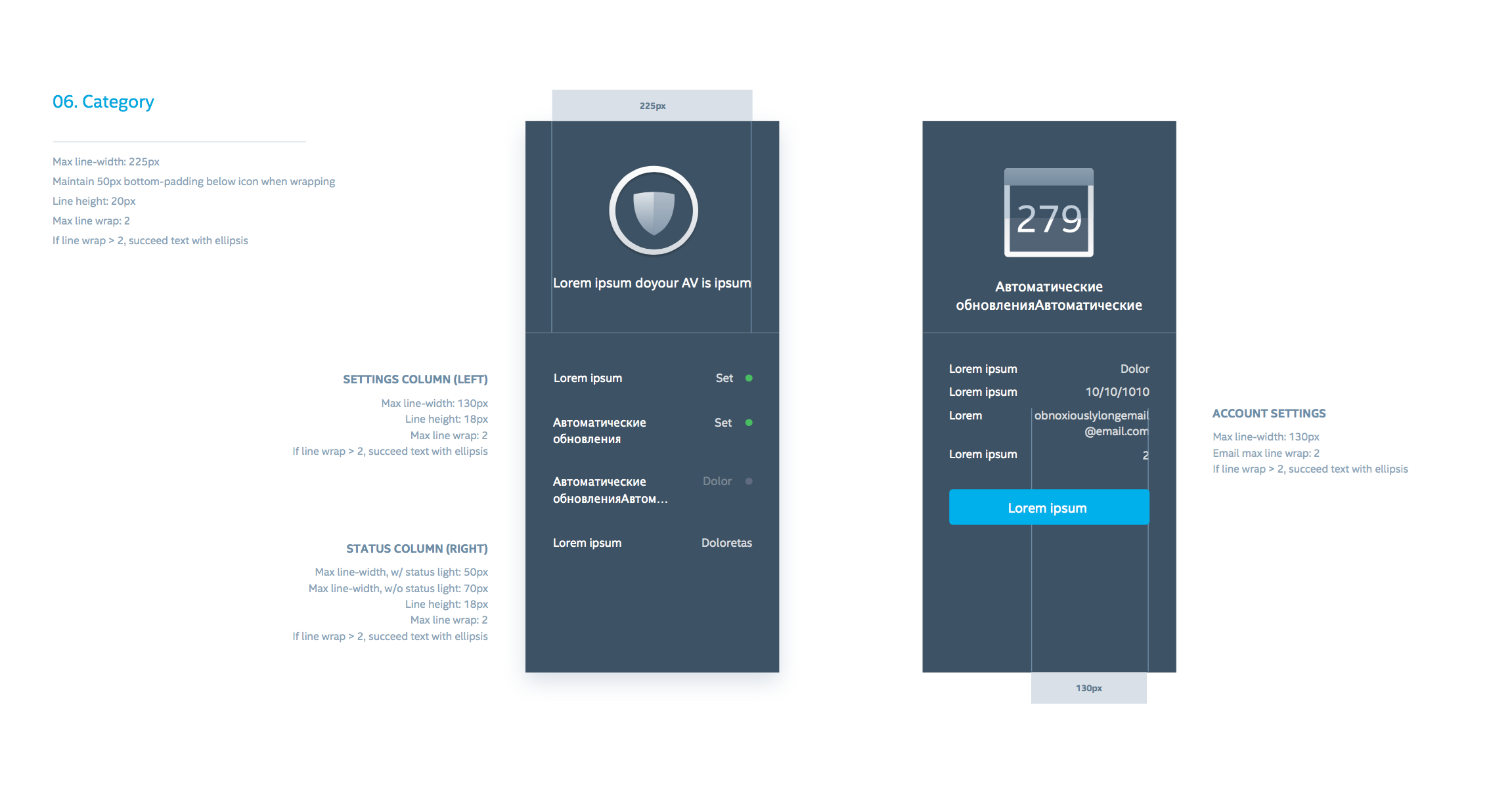
Taxonomy
As I mentioned earlier, McAfee Total Protection was advertised as “total protection for your data, identity, and privacy on all your devices.” The next taxonomy reflected the value statement and features were recategorized so they were easier to discover.
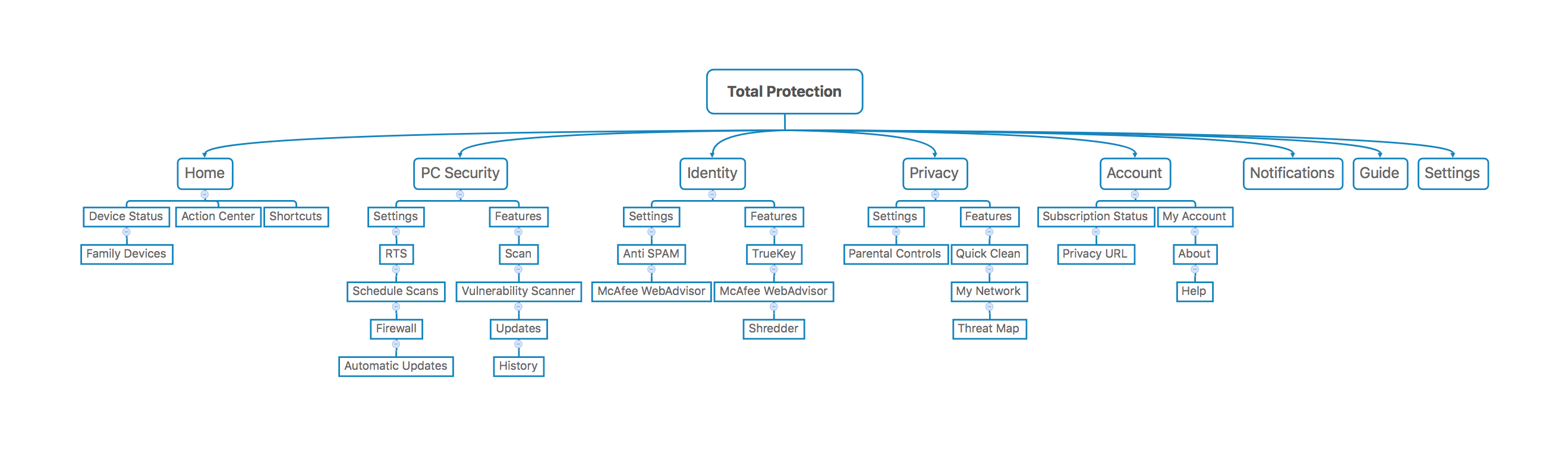
Visual Hierarchy
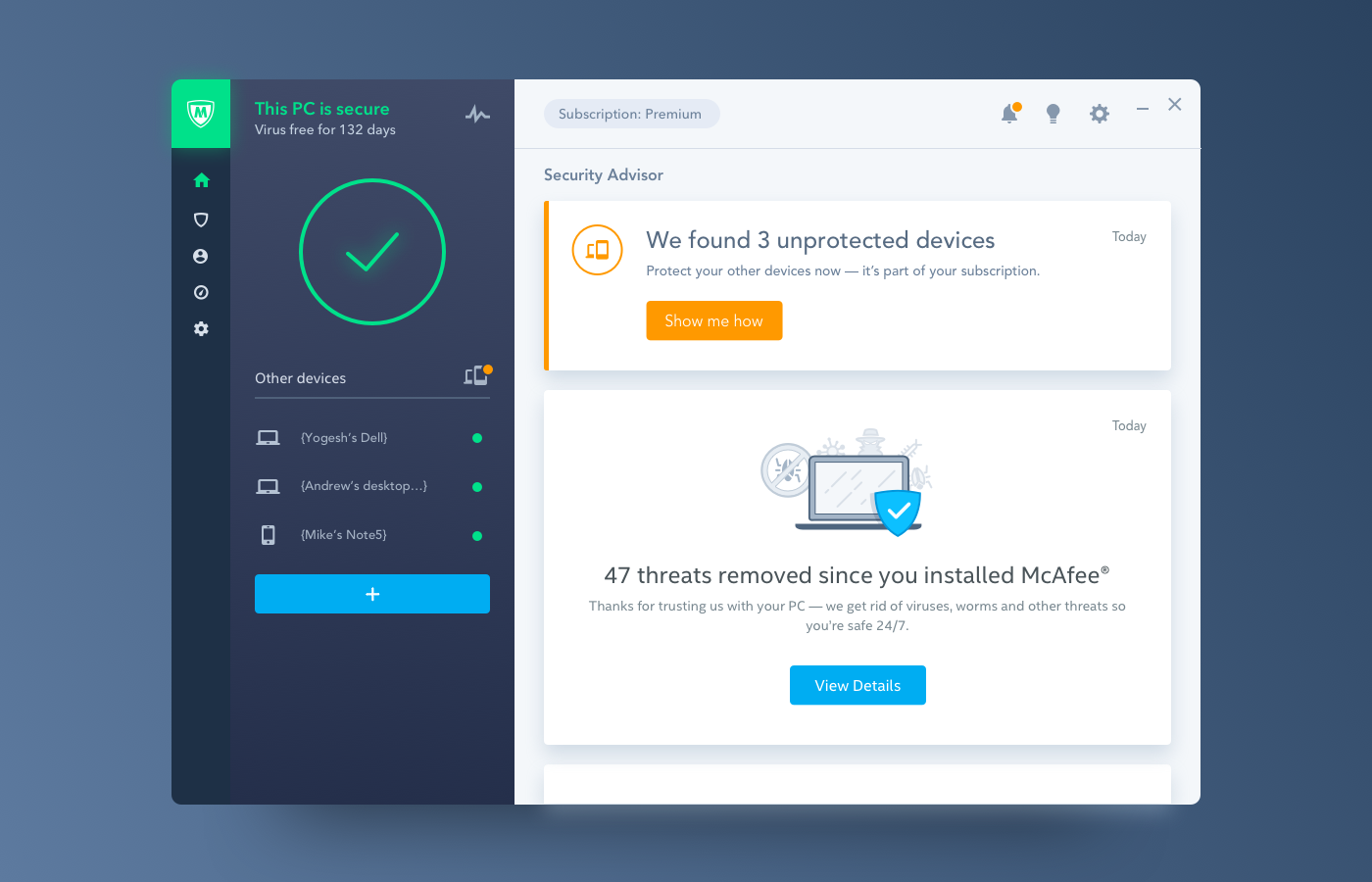
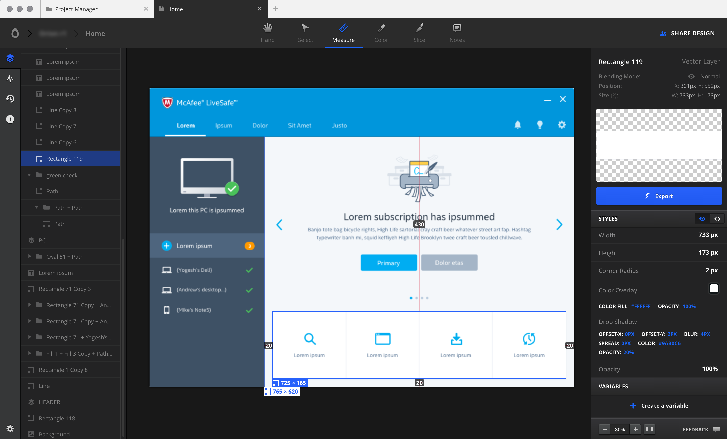
The PC security app had dozens of features and we were tasked to categorize and prioritize all of them. The way we chose to simplify the experience was to chunk the interface into three distinct sections: header, status and actions.
Header
The header was blue and chunky, because it was leveraged as a unified brand asset (Intel + McAfee). Also, we knew headers were recognized by users, but cognitively placed in their periphery, so we grouped the menu with it to ensure it was visible without being distracting.
Status
The status area was dark so the colors that represented security could pop and be processed more quickly. Also, the dark tone lead the user’s attention to the focal point of the application, the security advisor.
Actions
The security advisor is the most airy and brightly lit area of the application to draw focus. This is the area where the bulk of activity was designed to happen.
Real User Reactions
After testing multiple concepts, participants found this one to be the simplest.
“Everything about this seems pretty straight forward”
“Glad it tells me what needs to get done. I don’t have to go find it.”
“Tells me I’m secure… Everything is pretty much where I expected.”
“Oh wow, this is nice. It’s simple like IKEA.”
“It’s not very complicated… it’s nice it shows how it protects my PC and other stuff. It’s clear.”
(pointing to the menu) “It’s good it tells me where to go to run a scan or secure my accounts.”
Single Focus
“We are not our users.” – Sara Cole, director of User Research
I have to admit, it took me longer than it should have to fully understand what Sara was talking about. In truth, everyone in the company was closer to the product than any user would ever be. There was a general assumption that if we could better explain the product or force behaviors, users would be instant lifelong customers.
However, we didn’t know if unused features were too hidden, too confusing or entirely useless. To avoid overwhelming users with selection options, the Security Advisor was designed to guide them through everything they needed to know, and help us learn what mattered most to them along the way.
1. Take control
If McAfee found a virus, users could fix it quickly.
2. Try something new
If a feature needed to be setup, the advisor would walk users through it.
3. See the proof
If it’s been a while, the advisor would summarize everything McAfee did in the background.
The Approach
Lean Design & Agile Development
Development was agile, but the teams needed to know exactly what build before they could start coding: interactions, use case flows, exclusions, error conditions, animations, etc.
“We construct buildings in stages, but we can’t lay any concrete before all the blueprints are provided.” – Engineering Director
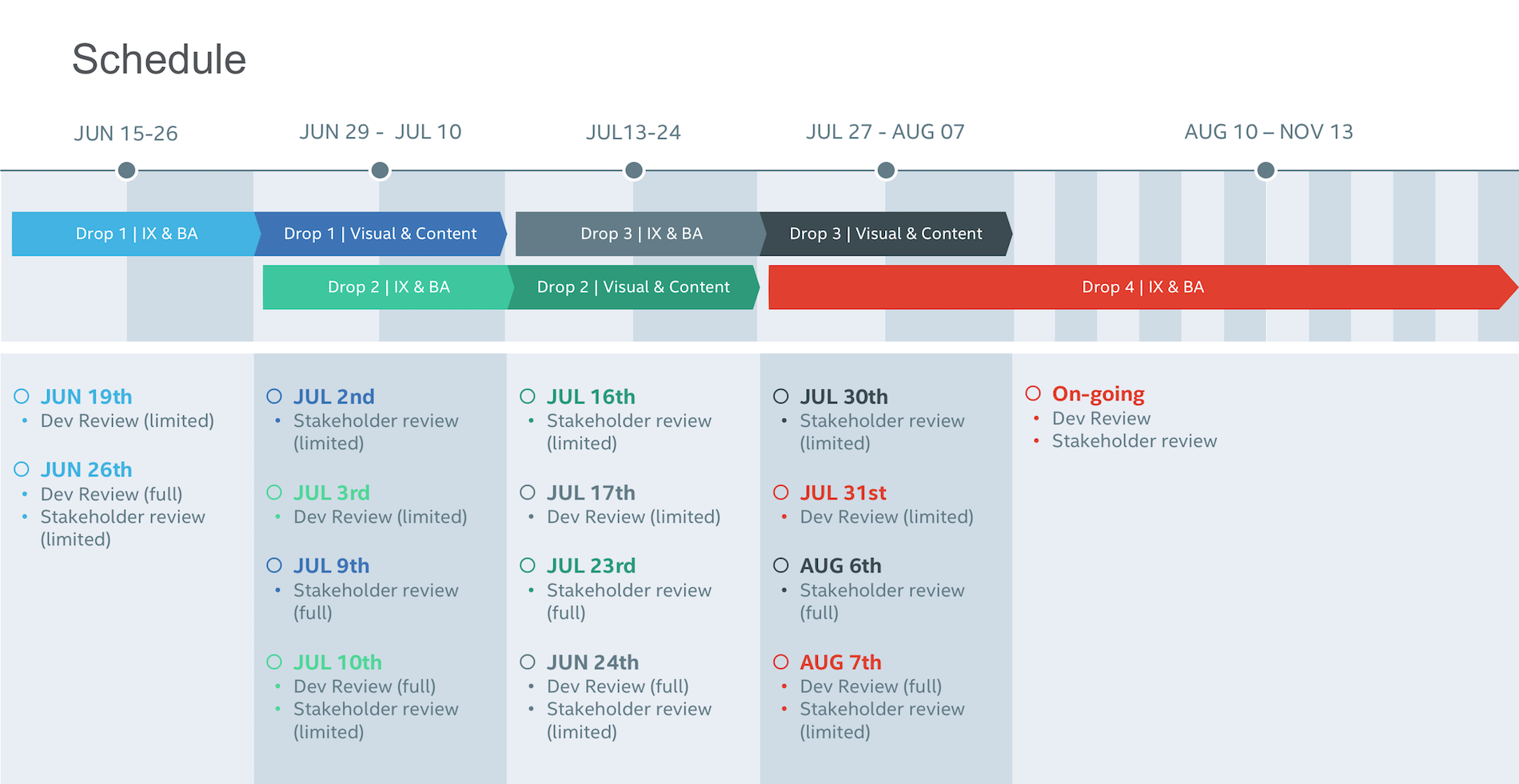
Similarly, my team needed to know what was possible to build and how long we had to work through designs. Aware of the release date, I worked backwards to scope the effort and set a design schedule that included detailed design reviews, usability testing, and specification delivery dates.
Design Process
Although our designs were to be delivered in classic waterfall fashion, it was incredibly important to maintain visibility in our process. Doing so helped us to ensure our designs were grounded, helped engineering teams better understand how we worked, and made people feel appreciated by being continuously included.
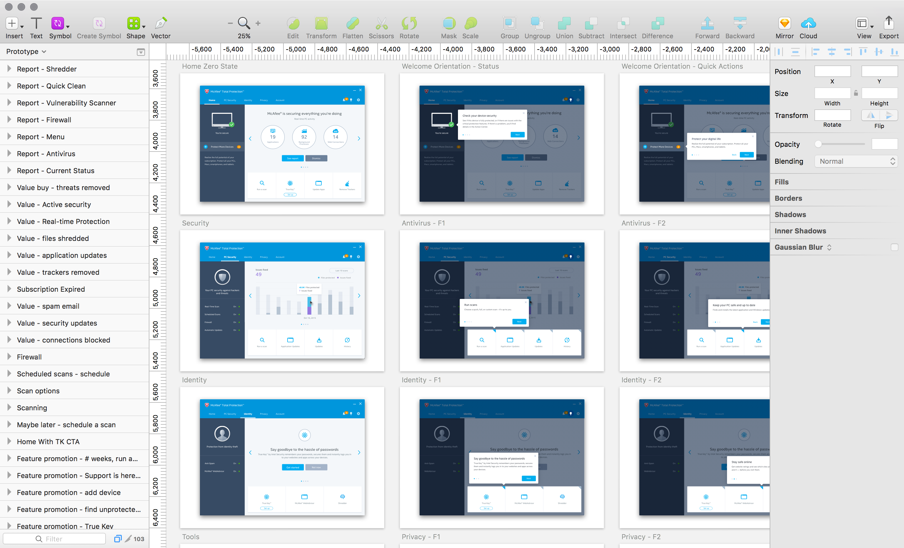
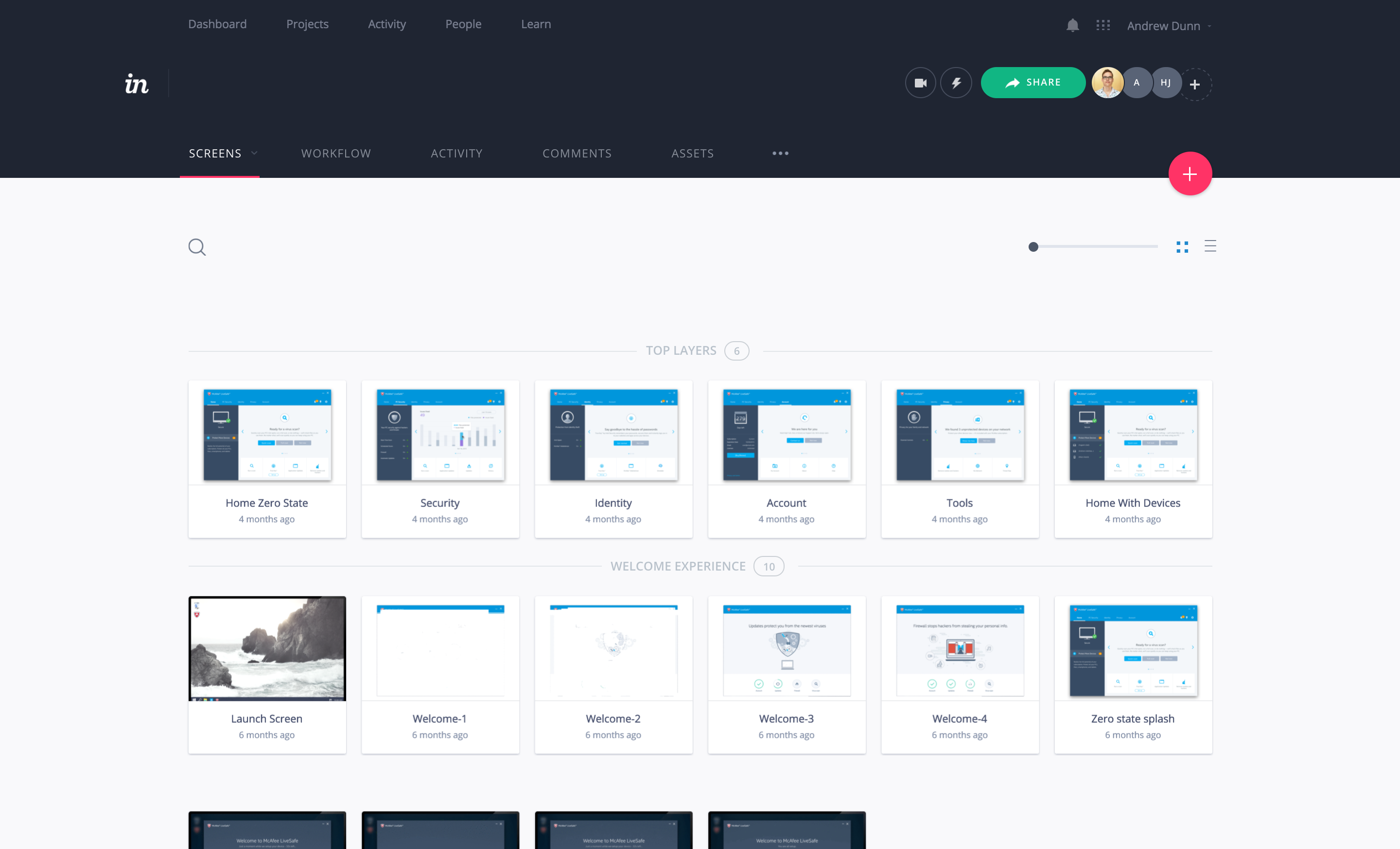
At the start, my team worked closely with product management and development architects. As time progressed, our concepts moved from whiteboards, to wireframes, to prototypes, to spec docs that we reviewed with individual scrum teams.
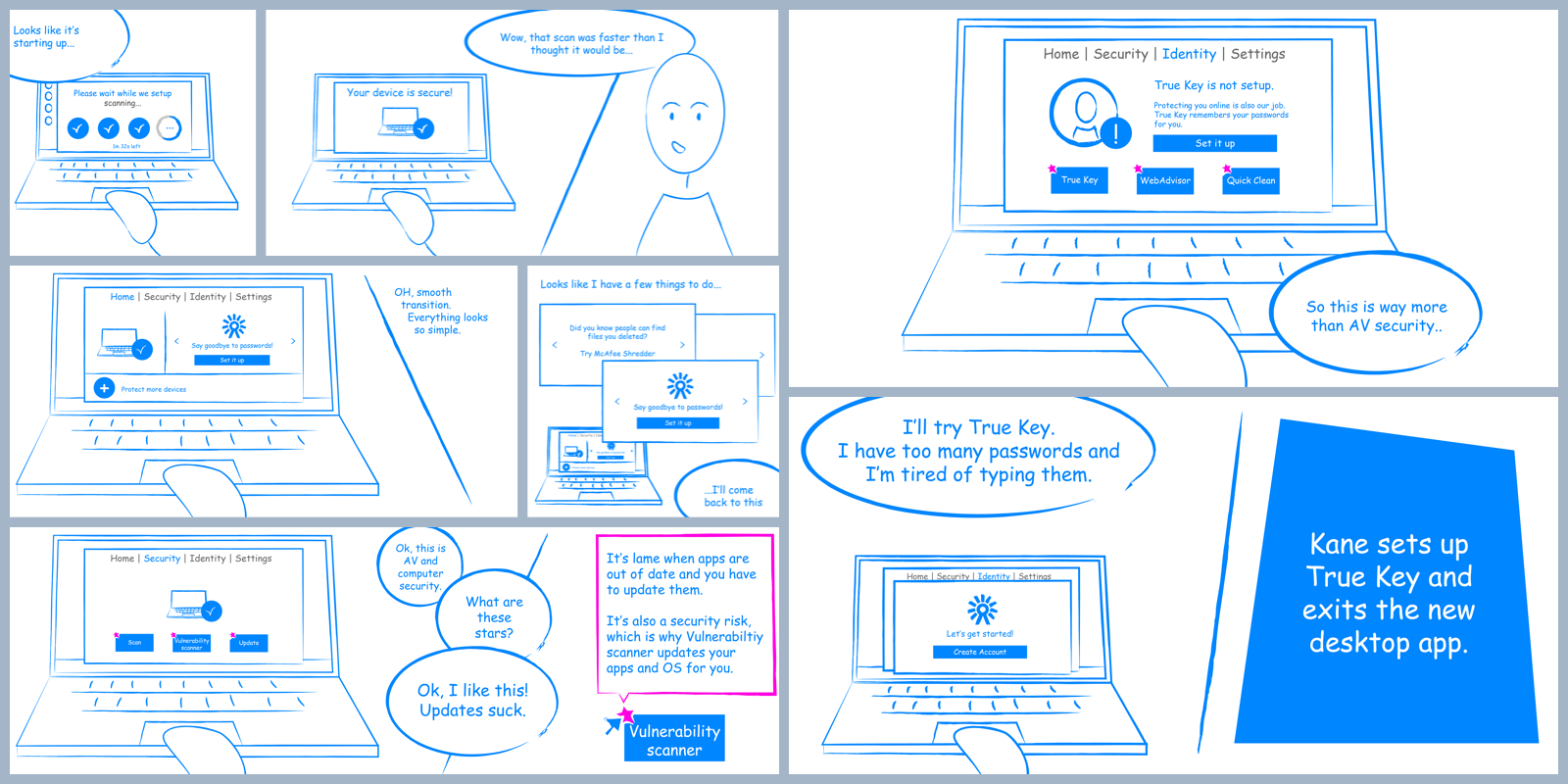
Prototype Prototype Prototype
Seeing is believing and prototyping accelerated just about everything. One prototype allowed us to review how the product worked with engineering, walkthrough scenarios with stakeholders, showcase progress with executive leadership, and test ideas with real users.
Sketch + Invision was the quickest and most effective way to gather feedback.
Detailed Specs
In addition to designing the PC security app, my team had to design specification documents for development teams to build the product and QA teams to test against. Like any good designer, I surveyed both teams to learn what had worked in the past and what needed improvement.
After a few reviews everyone agreed upon a documentation process that minimized the effort required by my team, and maximized the utility and clarity of everything we provided.
The documentation was structured so that every function of my team was able to contribute independently and provide updates that didn’t cascade. Our process empowered us to efficiently address the high volume of change requests that surfaced during sprints and sprint reviews.
My team consisted of a UX designer (me), business analyst, visual designer, and a content writer. Together we specified interaction rules, animations, use cases, mockups, content, localization accommodations, error cases, and more.
The Postmortem
The start of something better
I’m privileged to have been assigned a project so critical to the future of Intel’s security business unit. The entire process was exciting, rewarding, and tough. And for me as the designer, the hardest part was negotiating all the feedback I received (I’m still getting feedback).
The biggest lesson I learned was how to design with stakeholders. I wish I could say that I’m good at it, but I don’t know if I’m there yet. Approaching projects with humility and a spirit of collaboration requires an incredible amount of maturity. A maturity of character defined more by optimism and patience than hard skills, experience, or title. Ironically, designing with others gave me more influence over the final design.
A few other lessons learned:
1. It’s my responsibility to conduct a good design review.
2. Align on the problem before designs/solutions are presented.
3. Review design elements though specific scenarios that cater to the audience.
4. Always be prepared to answer a question, but don’t bullshit the ones you can’t.
5. Stop defending design decisions and start listening.
6. Stakeholder reviews are terrible venues to correct feedback.
7. Review designs informally with individual stakeholders.
8. Leverage design exercises to involve stakeholders, build relationships, and garner trust.
9. Work to arrive at solutions together.
Am I proud of what we did?
Absolutely. Our project team redesigned and built a significantly superior product in less than 10 months. Every function sought to fill operational gaps and maintained a missional focus on our customers’ needs. For our users and for the company it’s a colossal step in the right direction, but it’s still version 1.
Going forward, our customers must continue to be the focus when appraising a job well done. This requires we establish a horizontal UX strategy to bring customer centricity and aesthetic sensitivity to every product and every stage of the user’s journey.
Additionally, we must continue to experiment, measure, and learn to ensure we are delivering the best PC security experience. My hope is to leverage continued insights to buff up the security McAfee offers and further simplify the experience so users can confidently “set it and forget it.”