To comply with my NDA, I have omitted and obfuscated all confidential information. The information below is my own and does not necessarily reflect the views of Box Inc.
Details
Box Inc
2020
Project Summary
We helped users get started
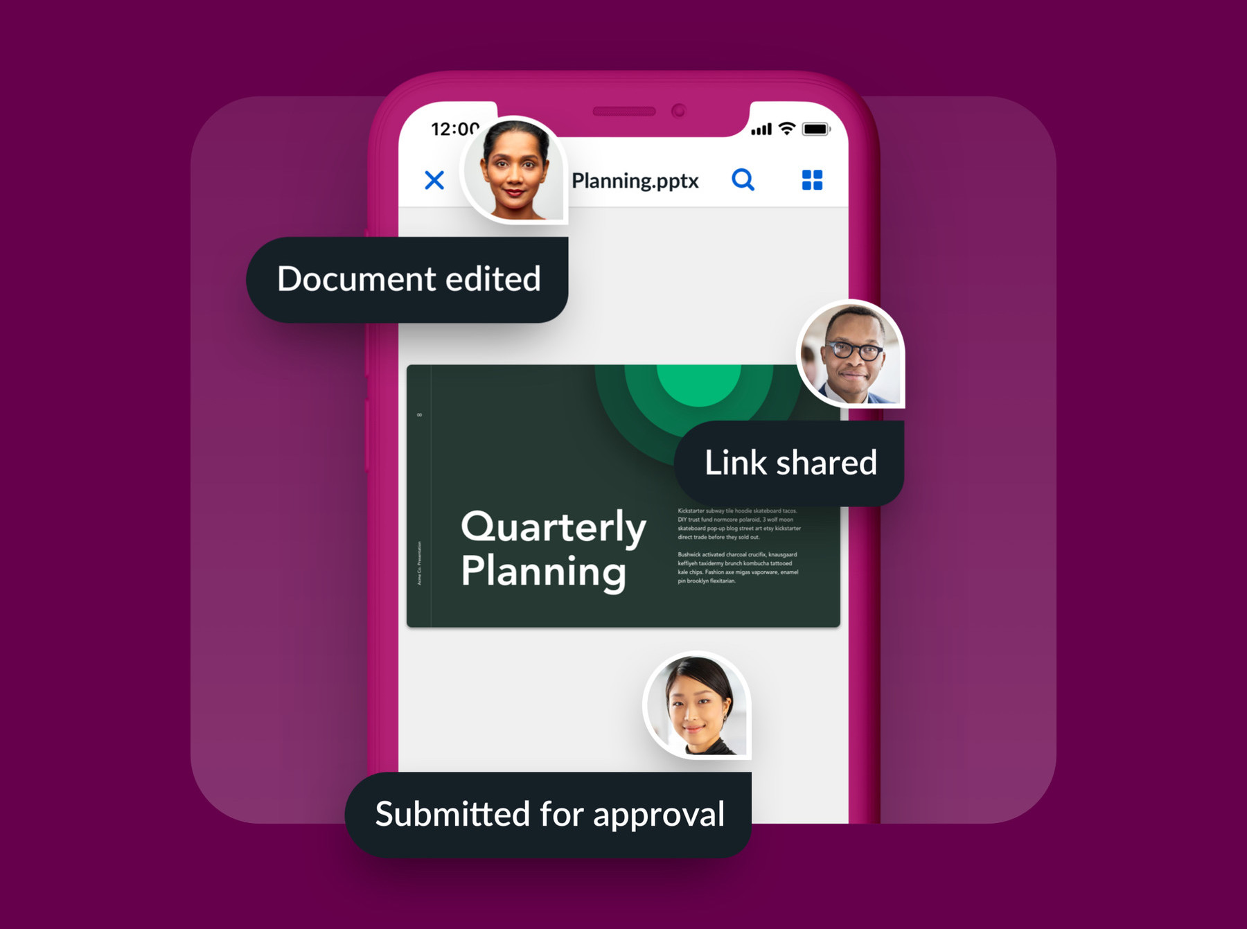
Product leadership at Box, a productivity tool that enables teams to upload all their documents to the cloud for safekeeping, sharing, and real-time editing, directed my team to focus on user engagement and retention to reduce customer churn. We were the first in a few years to evaluate our user’s journey over their first 60 days, as well as the retention funnel.
We discovered a high bounce rate after users signed into their accounts for the the first time and identified several opportunities to help them get started. We built a welcome tour to highlight key ways Box makes working with their teams easier, a quick start check list to guide their first steps, and a notification feed to announce new features and improvements – just to list a few.
A year since the start of our efforts, we saw the first time sign in bounce rate decrease by 24% and 60 day retention increase by 15 points.
My Role
I led the design of all product adoption initiatives from July – November 2020. My efforts included customer interviews, user testing, design workshops, design strategy, and all visuals presented in this case study. Additionally, I worked alongside 2 product managers, 1 business analyst, and 10 engineers.
Core Team
Sarah Sohn (Product)
Cynthia Song (Product)
Helene Grossman (Analyst)
Daniel DeMicco (Eng)
Alex Laughnan (Eng)
Case Study
Product Overview
What is Box?
Box is a productivity tool that enables teams to upload all their documents to the cloud for safekeeping, sharing, and real-time editing. Our primary competitors are Microsoft One Drive, Google Drive, and Dropbox.
Who Uses Box?
Box is a cloud content storage solution for all employees across all industries. There are a multitude of personas that share a common set of goals, but generally our users could be anyone: executive admins, HR partners, insurance agents, loan officers, scientific researchers, facilities managers, and more.
Discovery
Opportunity
Our business analytics team evaluated the effect of user engagement on customer retention and expansion. They found that customers with the highest user engagement had 22 points higher gross retention*, and if all customers were magically more engaged, then we’d be able to increase total net retention** by 15 points (equal to tens of millions of dollars in ARR).
* Gross Retention is the total percentage of customer churn (customers that cancel their subscription or reduce their seat count)
** Net Retention is the percentage of customer churn + customer expansion.
Reviewing usage and retention
Helene, our business analyst, provided our team with a variety of data views that informed our product strategy.
Evaluating the user journey
To better understand the retention funnel data, we mapped the user journey starting from the initial point of discovery.
When companies purchase Box, admins create accounts for everyone in their organization and employees are emailed to setup them up. Although the setup process was quick, just a few clicks, we noticed it didn’t provide users with information about the service or guidance to get started.
Insights from our listening posts

Our cancelation survey found many users were not aware of Box’s collaborative features. They mostly considered Box a place to backup their files.

Marketing and Customer Success shared how it was difficult was for users to learn best product practices. They offered a Box training seminar every quarter that garnered a few thousand attendants.

A recent field (follow home) study observed over 30 people completing key job actives using a variety of tools. Some people used Box a lot throughout their workflow, some a little, and some were reluctant to, because they felt it was too much change management.
Problem Definition
Many users didn’t know how Box could help them or their teams work better. A using Box meant they would have to transition from one way of working to another, which was costly.
We found people were averse to using Box until the benefits were clear and it was demonstrated to be easier to use than alternatives.

People didn’t know how to best use Box
Since learning was self-guided, users would default to familiar habits and limited ways of working.

People didn’t know all that Box could do
Most people knew Box was a tool to backup and share files, but were not aware of collaborative team features.
UX Strategy
Product Adoption Frameworks
We reviewed a variety of frameworks illustrating how and why people commit themselves to products.
Generally they encourage focusing on “Aha moments,” where a person tries a product in small successive bites (a set of easily repeatable actions) that help them accomplish a goal and actualize its value. When a large product is broken down into simple activities, people are more motivated to try it and build a habit with it.


Reviewing Competitors
We documented the first log in flow of dozens of competitive and inspirational products to study onboarding patterns and strategies.
Here’s an excerpt from a design workshop that includes a summary of our findings:
Experience Principles
We aligned on a set of guiding principles to shape the experience strategy based on challenges our users were experiencing, adoption frameworks, and competitive examples.
👋
Be welcoming
To inspire action, Box should introduce itself to help users become familiar with the many ways it enables them to work better.
👉
Provide guidance
To avoid analysis paralysis, Box should provide direction, recommendations, and shortcuts to help users get started and develop deeper habits.
🙌
Enable quick wins
To accelerate time to value, Box should focus users on simple activities that help them accomplish something meaningful with little effort.
Goals & KPIs
Increase
Day 1
Activity
Increase
28 Day
Activity
Increase
8 Week
Retention
Increase
MAU
Feature Usage
Approach
To align with stakeholder expectations to move quickly and delver results within a quarter, we took a phased approach and released experiments targeting key moments along the user journey every few sprints.
Project 1
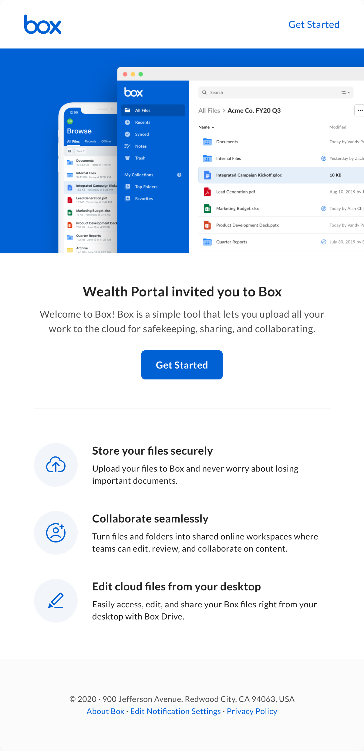
Invite Email Revamp
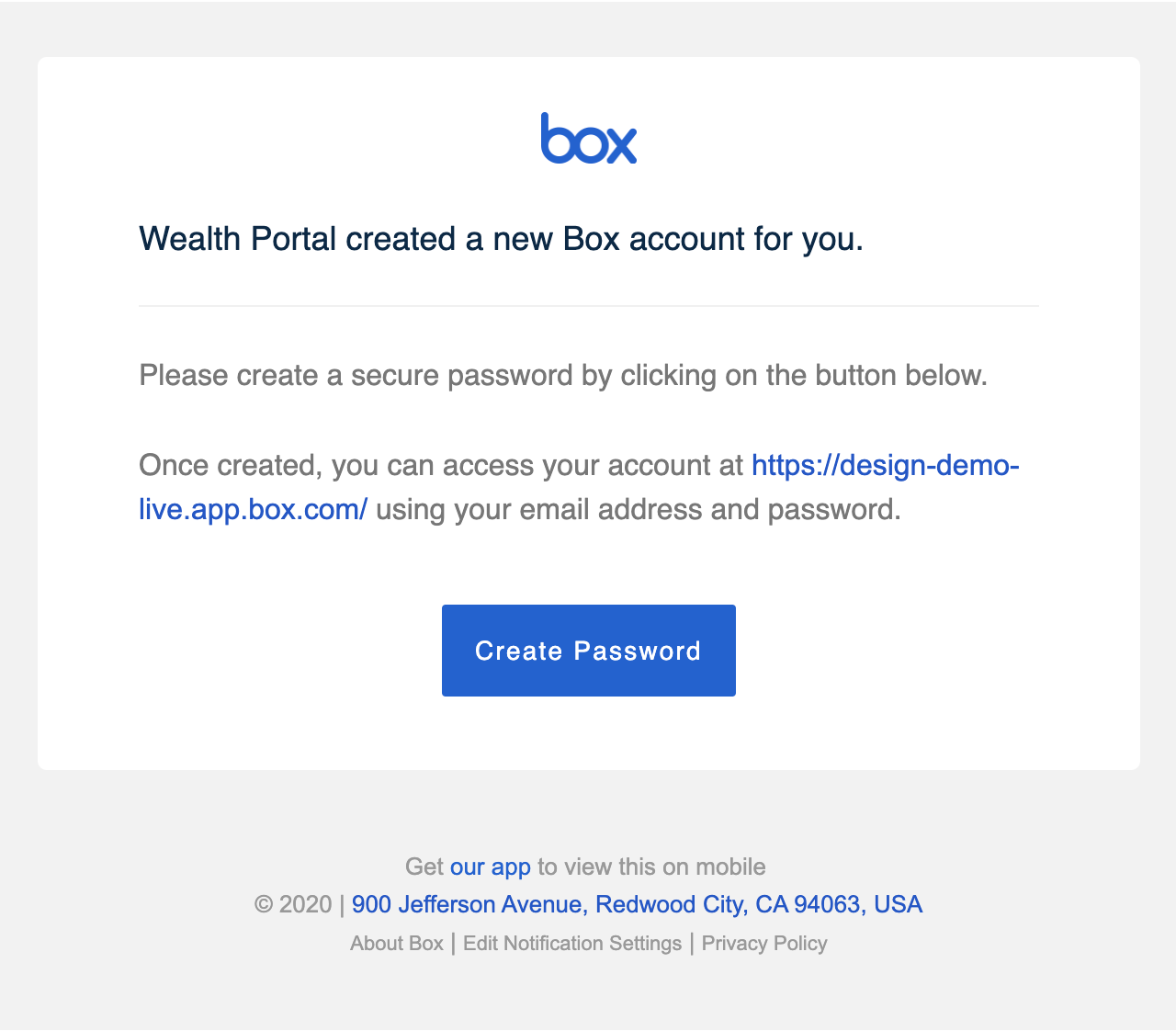
When IT administrators created a Box account for an employee, the employee would receive an email notification prompting them to create a password.
Data & Insights
Our data analytics team found a large percentage of people never took action to setup their account. And user testing the existing setup flow provided two related insights:
- Participants that did not know what Box was were reluctant to click through.
- Participants that were familiar with Box mentioned they would delay setting up their account until they needed to.
Hypothesis
If the email included a brief overview of Box and a few value propositions, users would be more likely to click through.
Final Designs
Results
+16%
Relative lift in click through rate
+6%
Total increase in sign in rate
Project 2
Welcome Flow
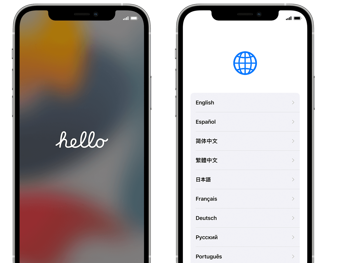
When we first started noodling about what happens after users sign in, we were inspired by setup flows that allowed users to personalize their experience.
e.g. before you can send a text on an iPhone, you are greeted with “hello” and asked to select a language.
The best product setup flows also helped users actualize value quicker. They guide users through a series of simple tasks that make the product familiar and easier to use when it’s time to get started.
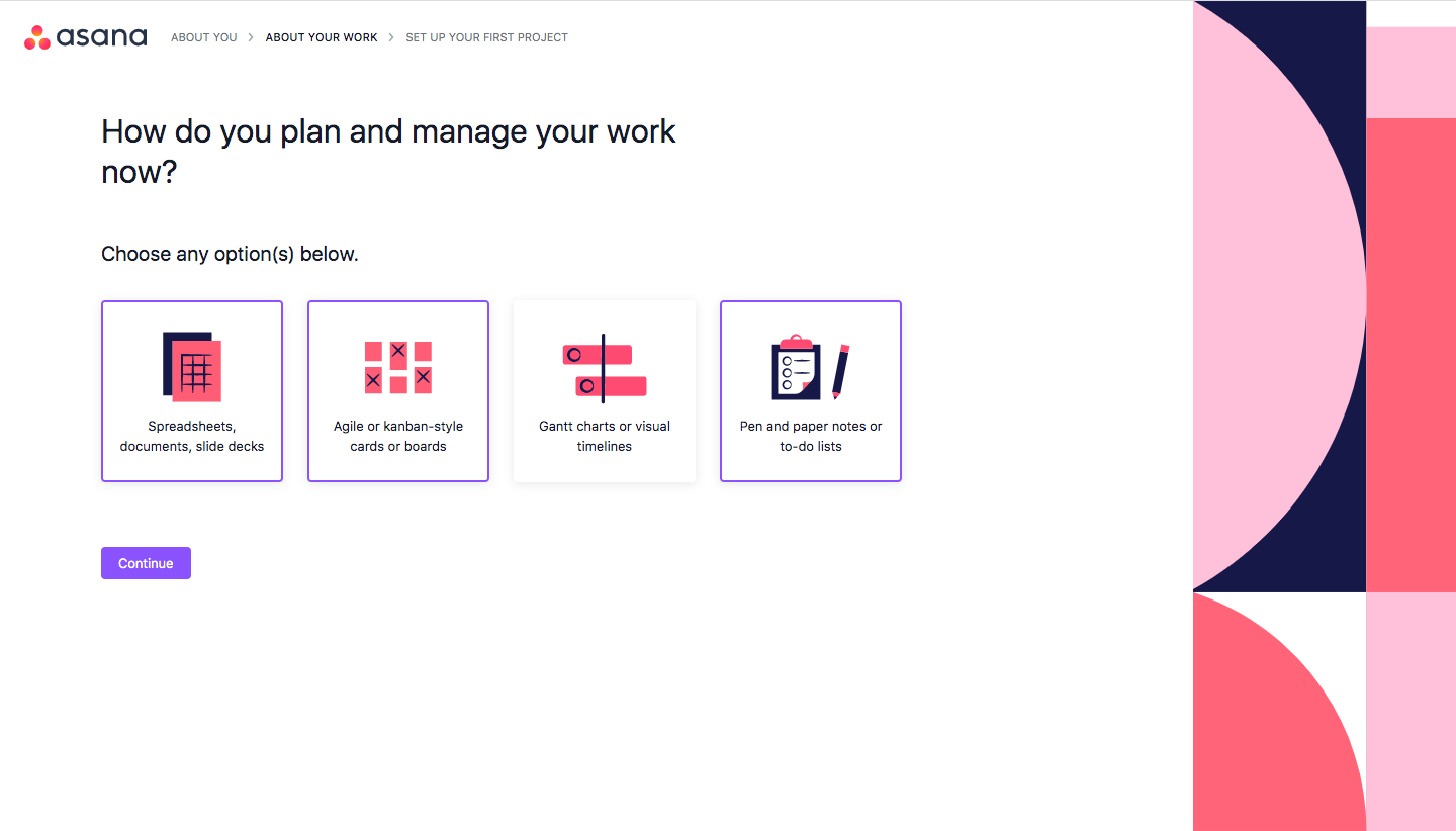
e.g. Asana asks users how do they would like to manage their projects before they are ushered into the app.
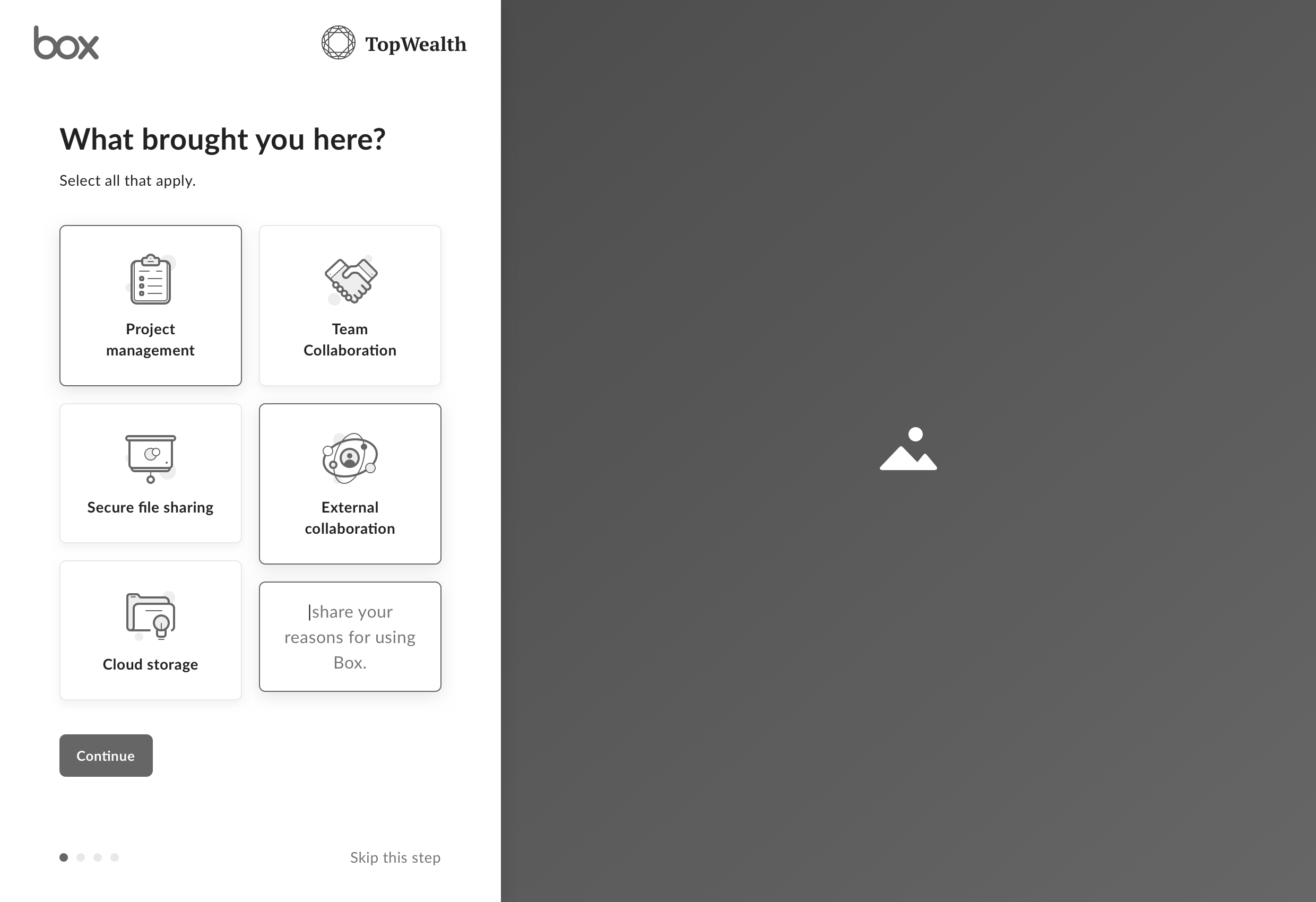
Identifying Key Tasks
To get started conceptualizing a setup flow, we listed a few use cases and broke them down into a series of tasks.
There’s a general set of tasks users can complete to solve for a wide variety of use cases – all of which are oriented around content. Making creating or uploading documents the first step towards reaching the “Aha moment.”
Hypothesis
If we guide users to create or upload content on day 1, then they would be more likely to retain over 20 weeks.
Concepts
We opted to leverage a full screen paradigm to guide users through a series of easy to complete steps to setup their account after they signed in.
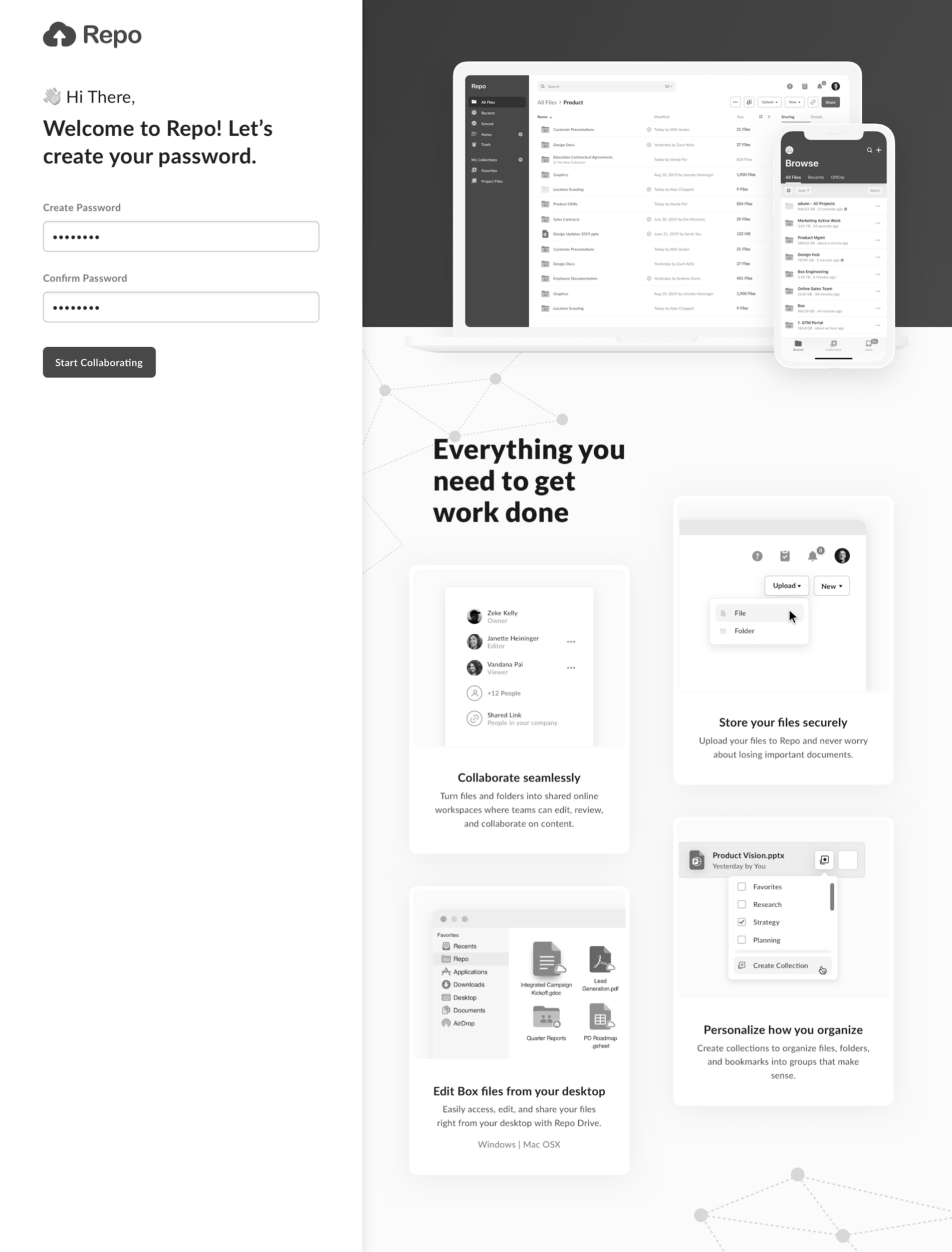
Sign in Screen
We conceptualized a new create password screen that welcomed users and communicated 4 points of value.
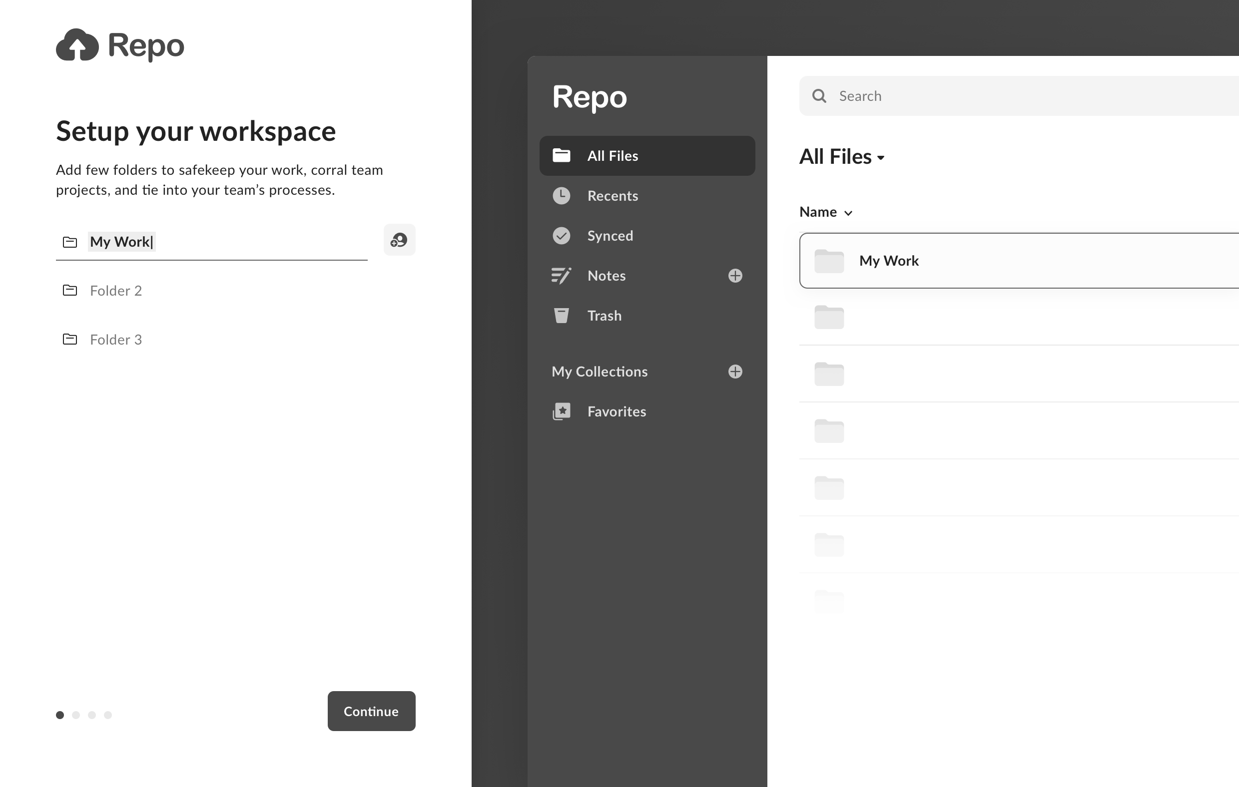
Folder Setup
We explored helping users setup a few folders and inviting teammates to collaborate.
Interaction
Typing a folder name would label a folder on the right. This interaction saved the user a few clicks and enabled them to become familiar with the product before they were left unassisted.
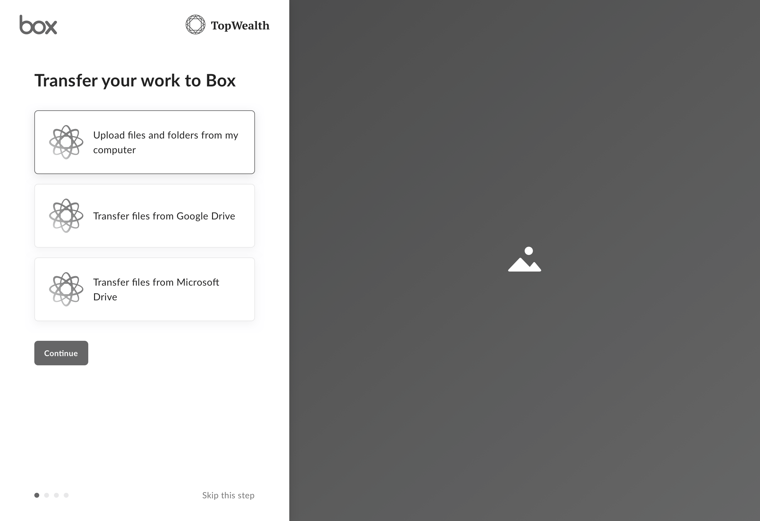
Adding Content
Creating and uploading documents is the primary step towards reaching the “Aha moment.” We considered three ways to help users get started without manually uploading files.
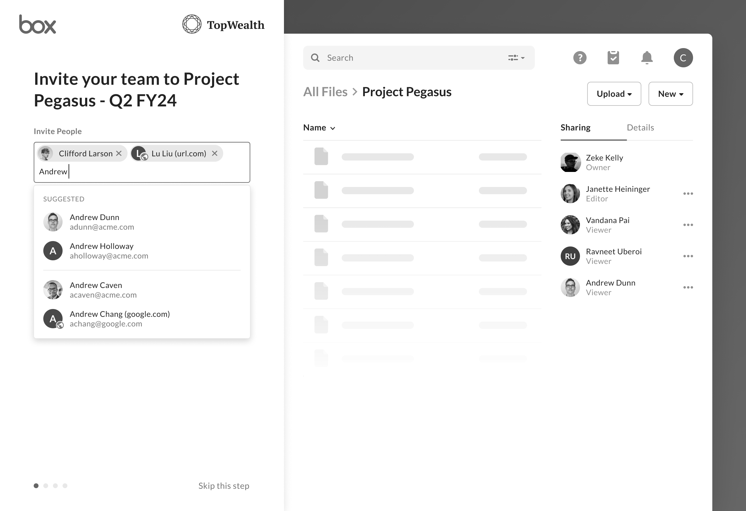
- Content migration to help users move their content (and habits) from a competing service.
- Adding users to a team to help them access relevant content.
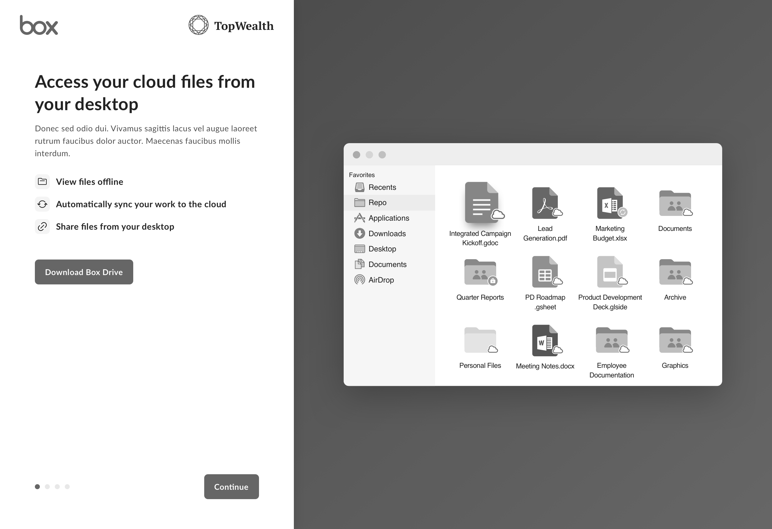
- Downloading Box Drive to help them backup all their work to the cloud.
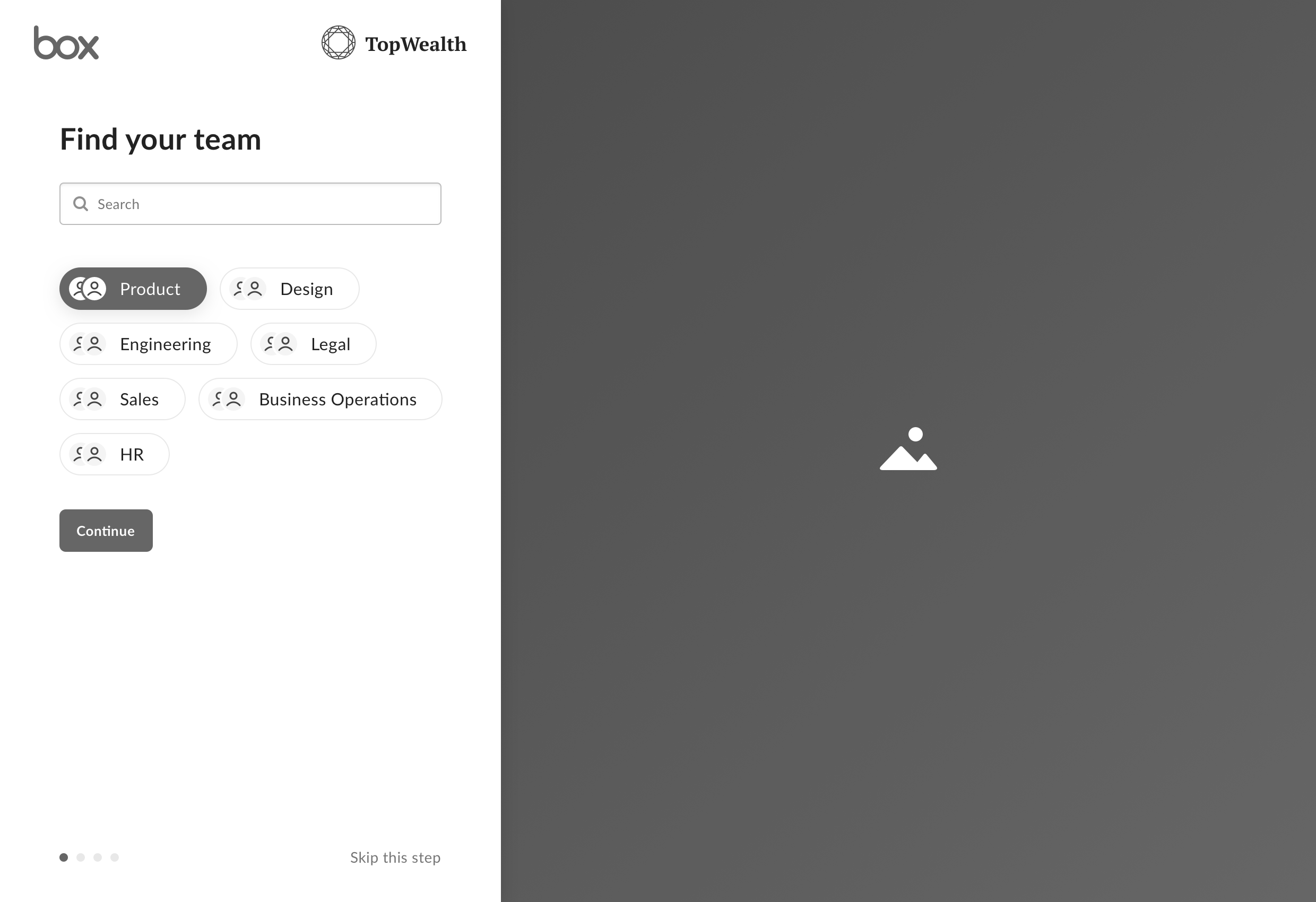
Personalization
We also considered a variety of concepts that would allow us to tailor the user’s experience based on their line of business, team, or job to be done.
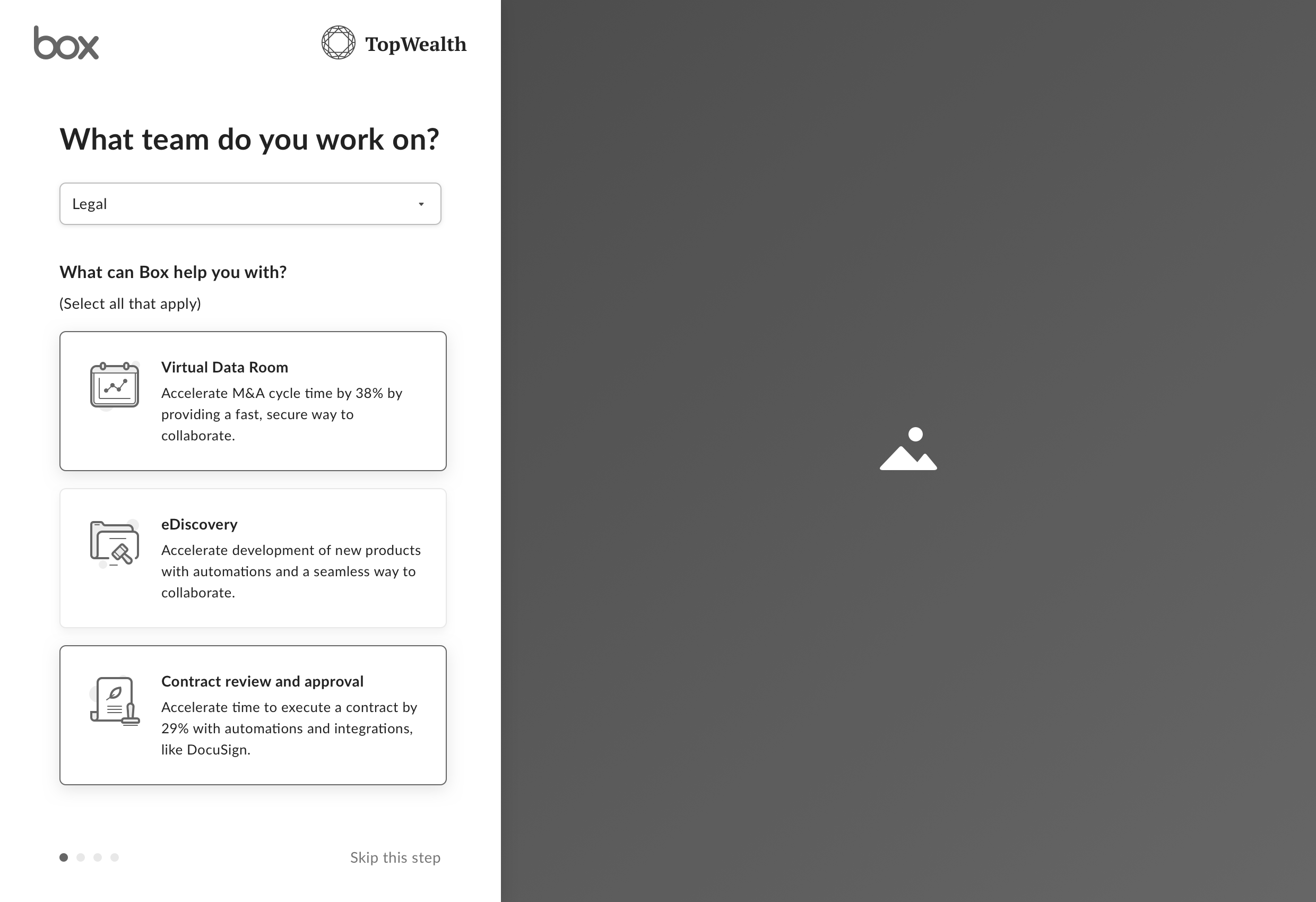
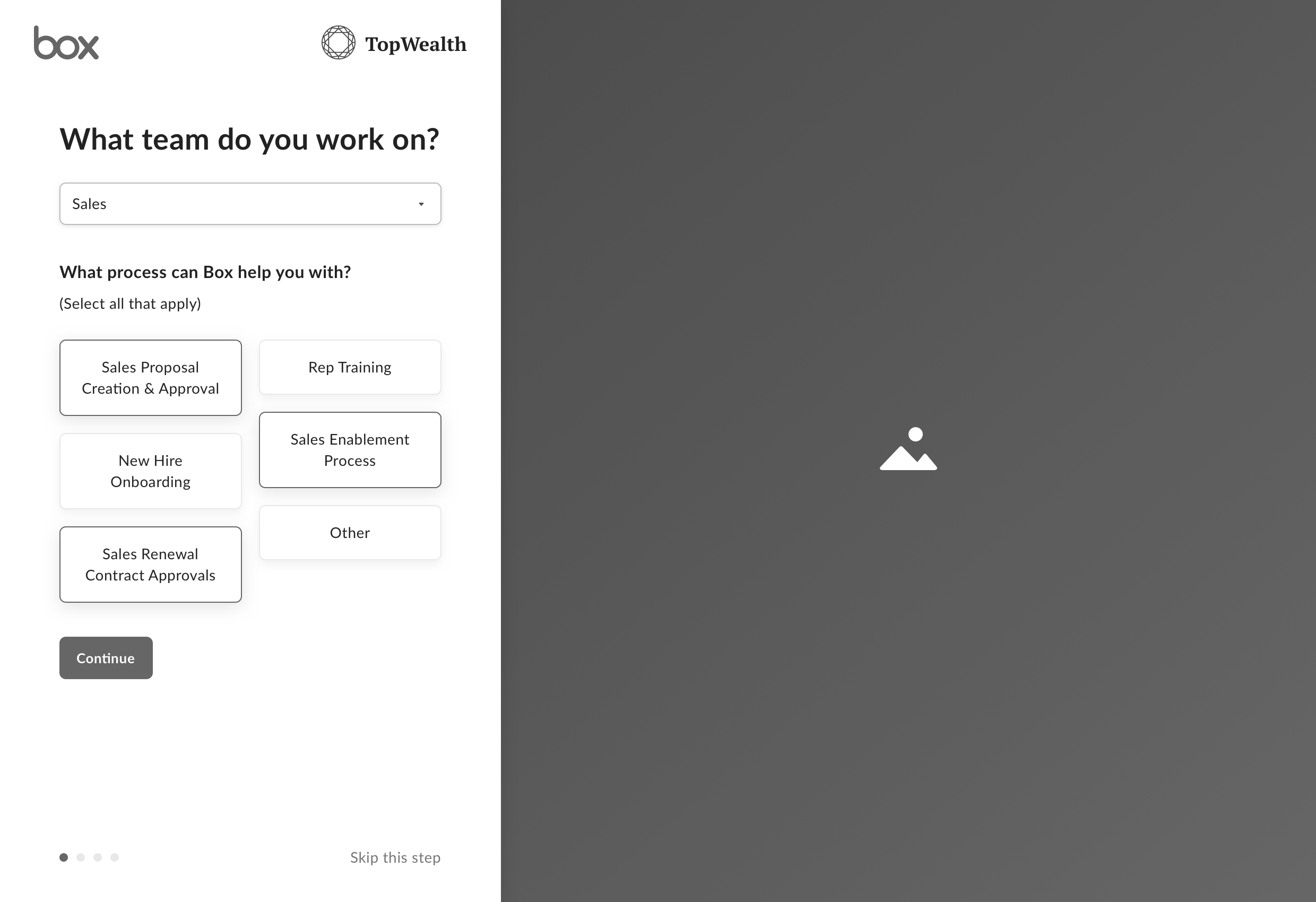
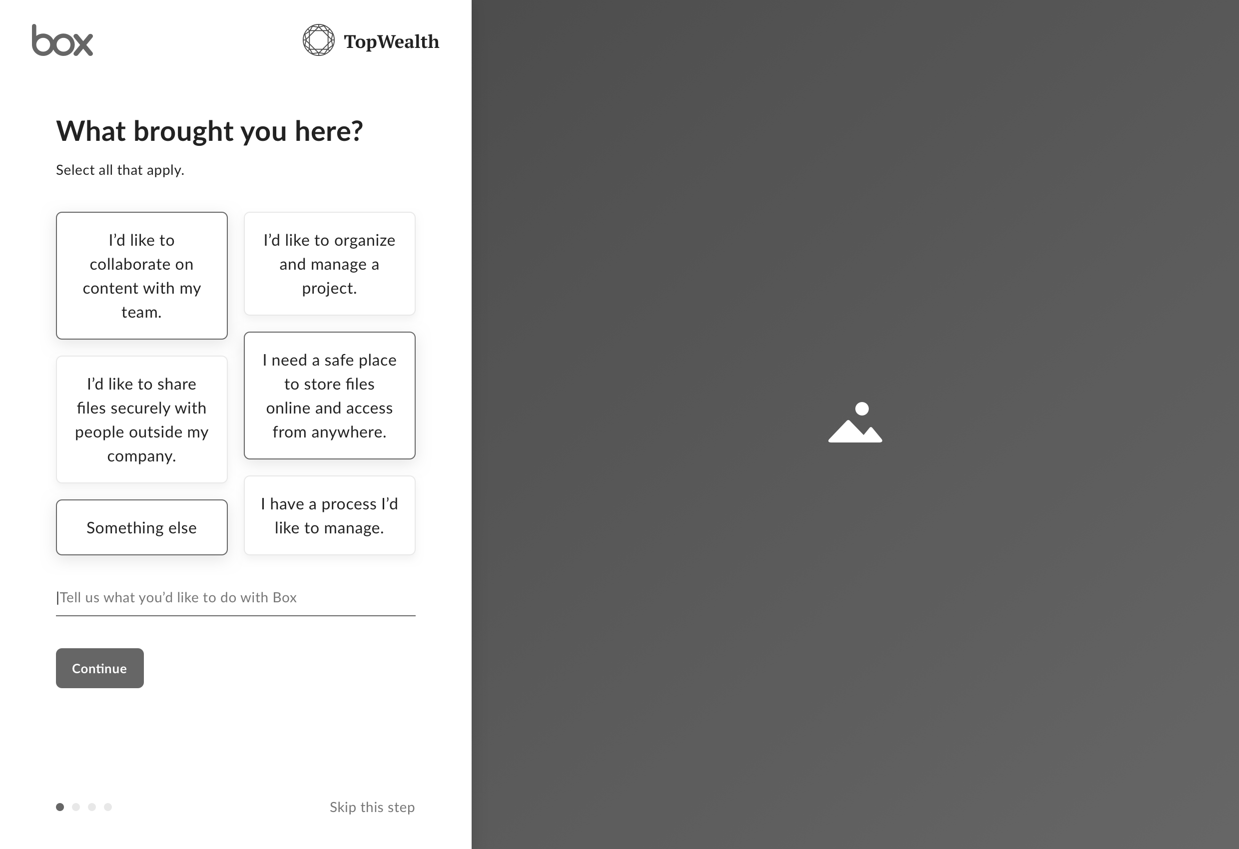
User Testing
We evaluated a prototype of the setup flow via usertesting.com with participants who never used Box before to learn how well the welcome experience introduced Box, encouraged users to create an account, and helped them get started.
Prioritization
Engineering estimated it would take 4x more time than we had available to build a Welcome flow that included all the setup steps we included in the prototype. We had to cut the ability to setup a folder structure, add a profile picture, and personalize the experience.
Final Designs
The MVP setup flow included a welcome screen, 4 points of value, and a call to action to download Box Drive.
Results
+62%
Relative lift in users who use Drive on Day 1
+9%
Total increase 2 week retention
Project 3
Empty States
Many users who signed in for the first time didn’t have any content in their account and were presented with an empty experience with no guidance.
Hypothesis
If we make it faster for users to create or upload content when their account is empty, then they would be more likely to retain over 20 weeks.
Final Design
Results
+5%
Relative lift in day 1 content uploads
+19%
Relative lift in day 1 file creation
+18%
Relative lift in day 1 folder creation
Project 4
Get Started Checklist
In the past, the marketing team experimented with a “get started check list” to help users learn key activities during their trial period and drive conversion. The checklist would present itself after users logged in for the first time.
If the user clicked on any of the check list items, a tool tip guide would walk them through a series of actions to complete a key activity, like inviting others to their trial. Completing each checklist item extended the trial period.
Although the check list was a success, the team that first released it wasn’t able to modernize it and it had been turned off a year prior.
We first became aware of the check list experiment during our design workshop, when a few engineers suggested we revive it to accelerate build time.
Opportunity
We were interested in experimenting with an onboarding checklist for a number of reasons:
- We all had had positive experiences with check lists in the past
- The marketing team’s experiment drove a double digit increase in conversion
- It helped users become familiar with a product through guided activities and actionable learning
- It motivated users to achieve a large goal by breaking it into smaller, more manageable tasks
- It leveraged the Endowed Progress Effect (A person will be more motivated to complete a goal if they are provided with a show of progress towards it.)
Hypothesis
If we guided users through a series of key activities within their first week, then they would be more likely to retain over 20 weeks.
Final Design
Our approach was to refresh check list component, as well as all tool tips and promotional modals to align with Box’s design language.
Design Specs

Results
+8%
Relative lift in day 1 content uploads
+8%
Relative increase logging into Box Mobile on Day 1
+28%
Relative lift in day 1 folder creation
+21%
Relative lift in day 1 Drive usage
+34%
Relative lift in day 1 Notes creation
Project 5
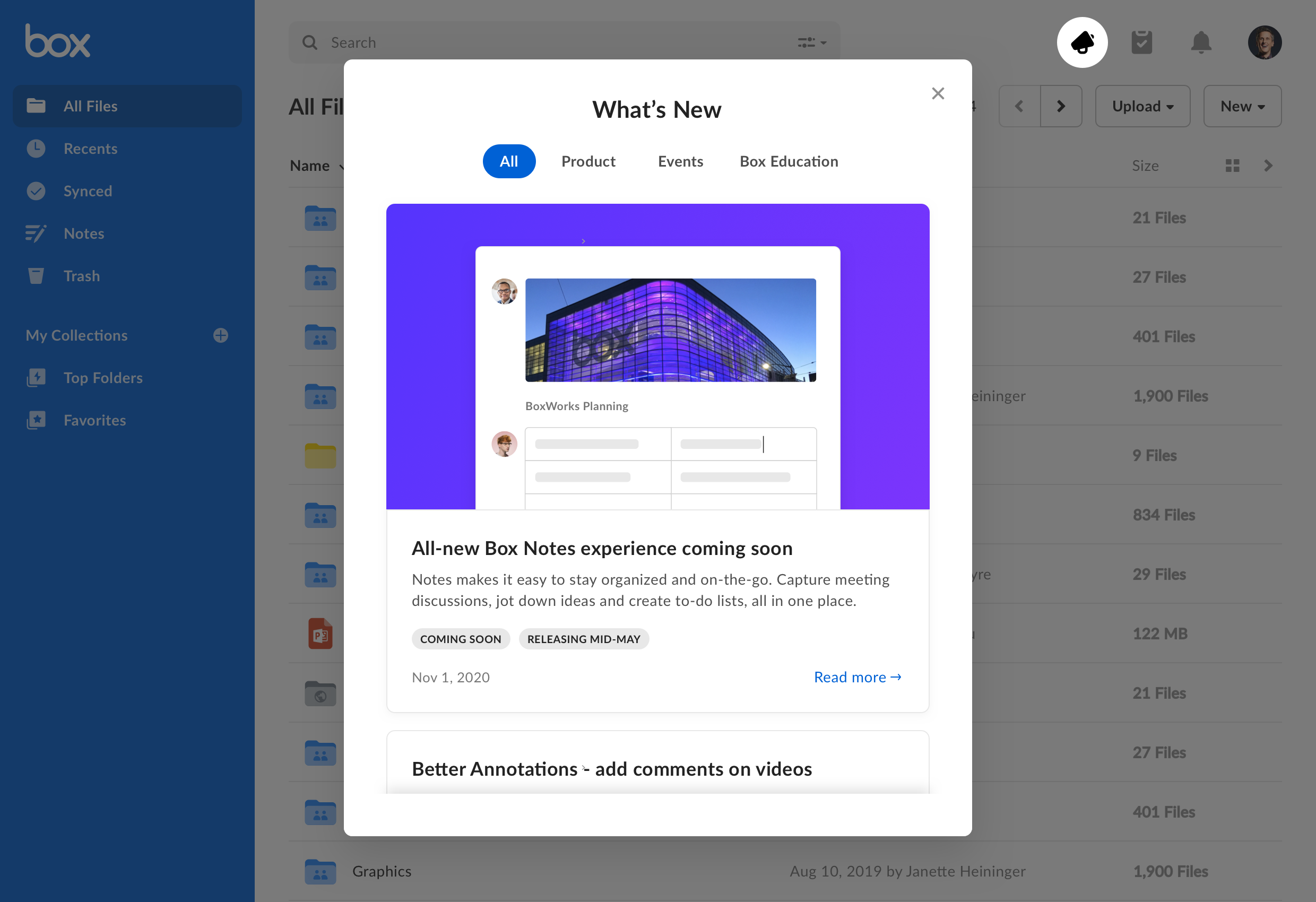
“What’s New” Feed
One idea from our design sprint that extended beyond our day 1 strategy was the “What’s New” feed. The What’s New feed was purposed for our marketing team to share product updates and learning activities with our users.
Although we shared product announcements via email, blog, and press releases, our communication channels had limited reach and engagement.
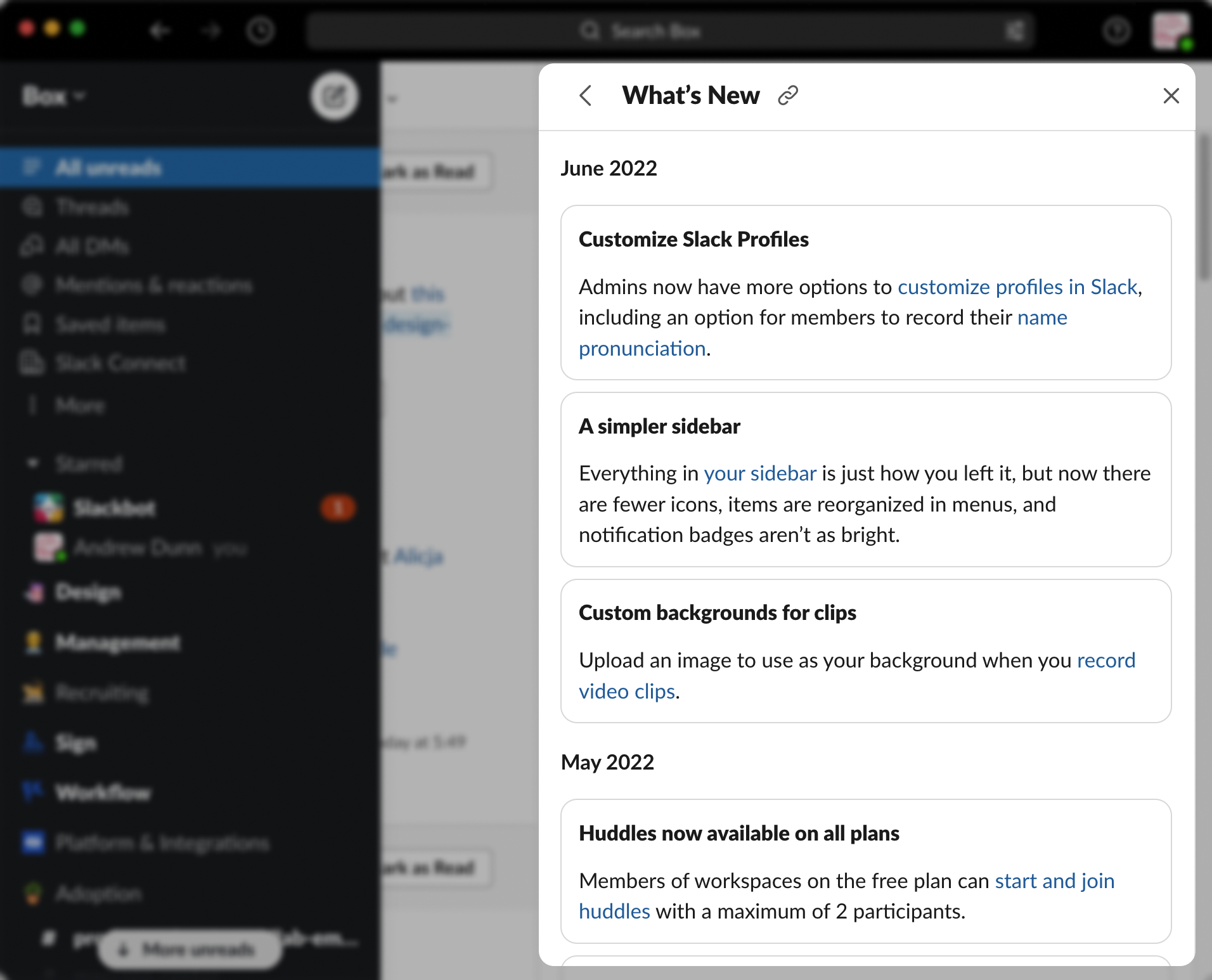
Inspired by competitive examples from Slack (and others) our team built a marketing communication channel within the product to increase feature awareness and drive engagement.
Hypothesis
If we can increase awareness of new features, people would be more likely to try them and we would increase top of funnel activity.
Concepts
The product requirements came together quickly. We knew we wanted to display our blog announcements in a feed within the application, and include an image, title, description, category tags, and ability to read more with each post.
Because there were so many similar “feed” paradigms we were familiar with, our focus was on:
- How would user discover the announcement feed?
- How would the announcement feed fit within Box’s information architecture?
- How would the user interact with the announcement feed?
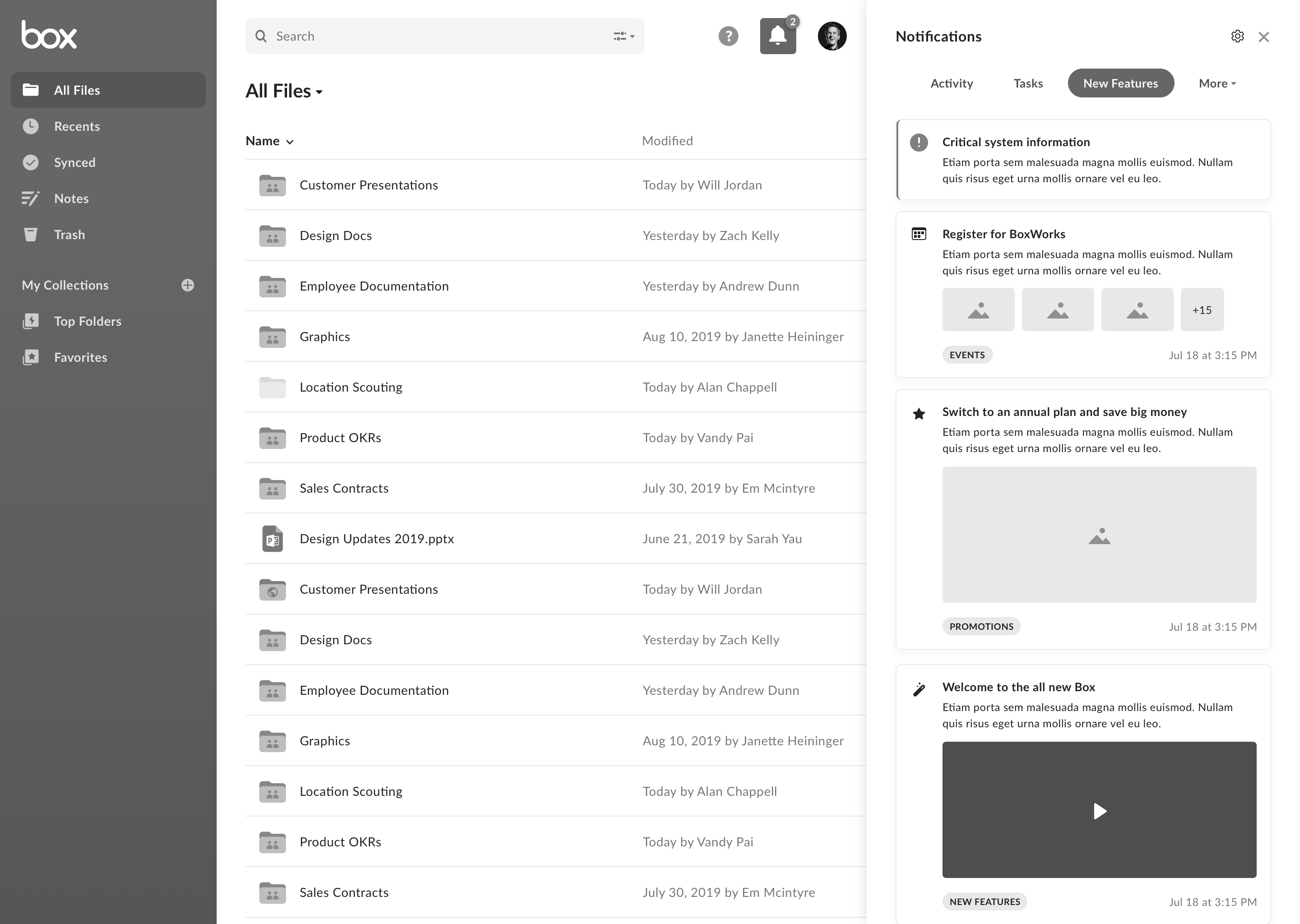
Notification Sidebar
It made the most sense to group product announcements with product notifications, and we explored concepts that pooled them together in a single sidebar that slid in from the right of the interface.
Although we strongly recommended a unified approach, it significantly increased the scope of work. Ultimately, we settled on making minimal changes to the IA and presented the feed in a modal.
Final Designs
Results
16%
MAUs engaged with What’s New
People who viewed announcements were 5x more likely to explore the feature